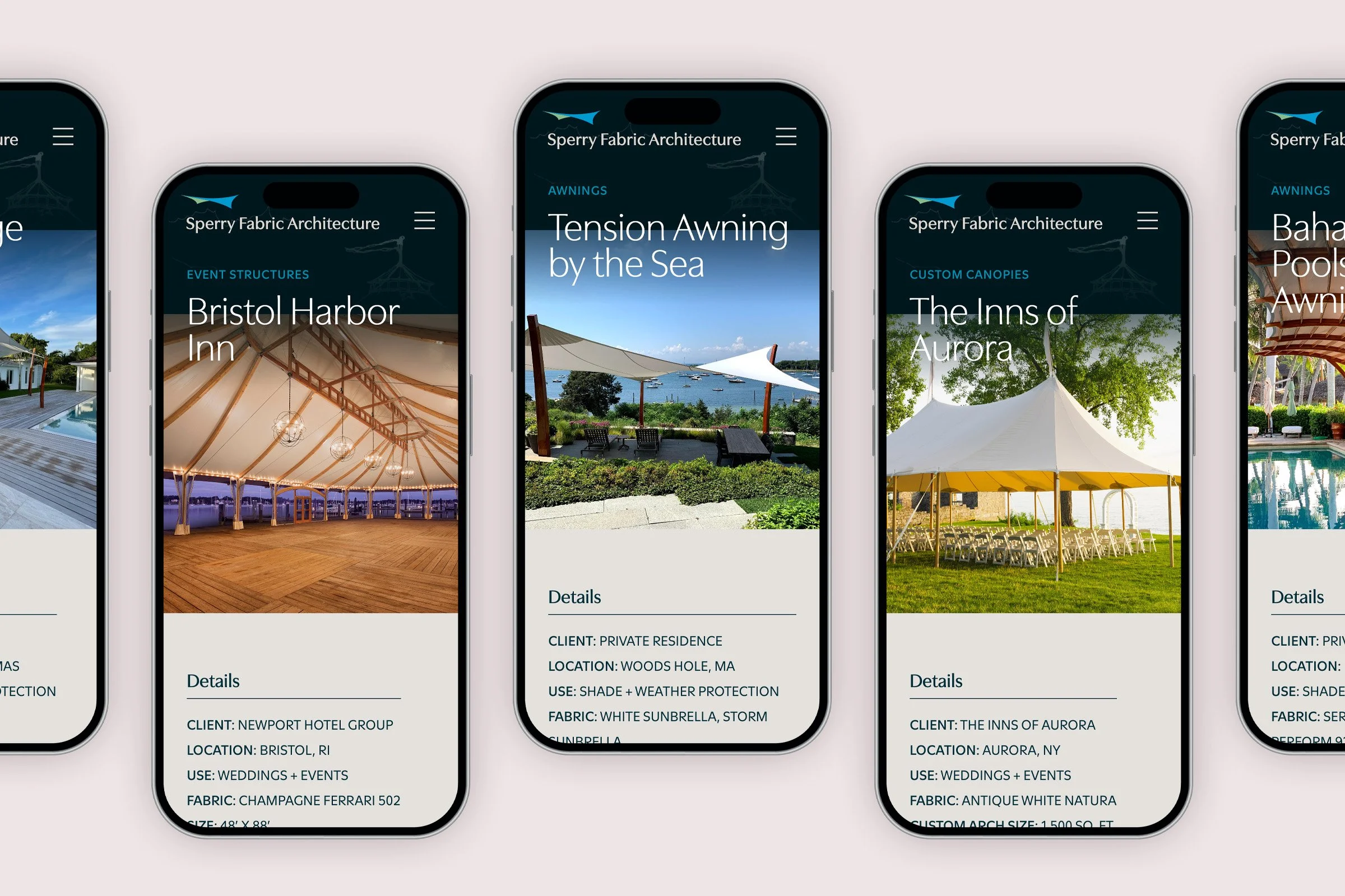
Project Team: Senior designer & project lead (me), project manager, content writer, art/creative director, client lead
Methods & Services: Stakeholder interviews, industry analysis, site mapping, content strategy & writing guides, wireframes, mockups, user testing, micro-interactions
The Challenge & Objective
Sperry Fabric Architecture’s former website wasn’t reflecting the artistic and dynamic nature of their custom products or showcasing the full range of their team’s capabilities with wood, metal, and fabric materials. Consequently, it wasn’t attracting the right type of well-qualified leads the business was seeking.
As the team lead, I began by setting the goals for this project which included bringing greater clarity to Sperry’s fully custom product offerings and building process as well as inspiring and attracting the right types of future projects.
Gathering Insights
Understanding The Audience & Customer Base
Through our initial interviews we discovered Sperry’s custom structures appeal to a variety of prospective clients. This range could include a homeowner looking for a custom patio awning, a resort owner looking for a unique event structure, or even an architect assessing Sperry’s capabilities.
While their projects span across residential and commercial spaces, the broadest and strongest pool of potential clients comes from commercial properties such as resorts, hotels, wedding venues, restaurants, golf clubs, and apartment complexes.
Sourcing Inspiration
Through the process of reviewing competitor websites, I realized the custom-built nature of Sperry’s work is more of a distinguishing factor than the actual products themselves. This led me to towards sourcing inspiration from companies in the adjacent fields of architecture, interior design, and landscaping whose audiences also make emotionally driven, high-value purchasing decisions.
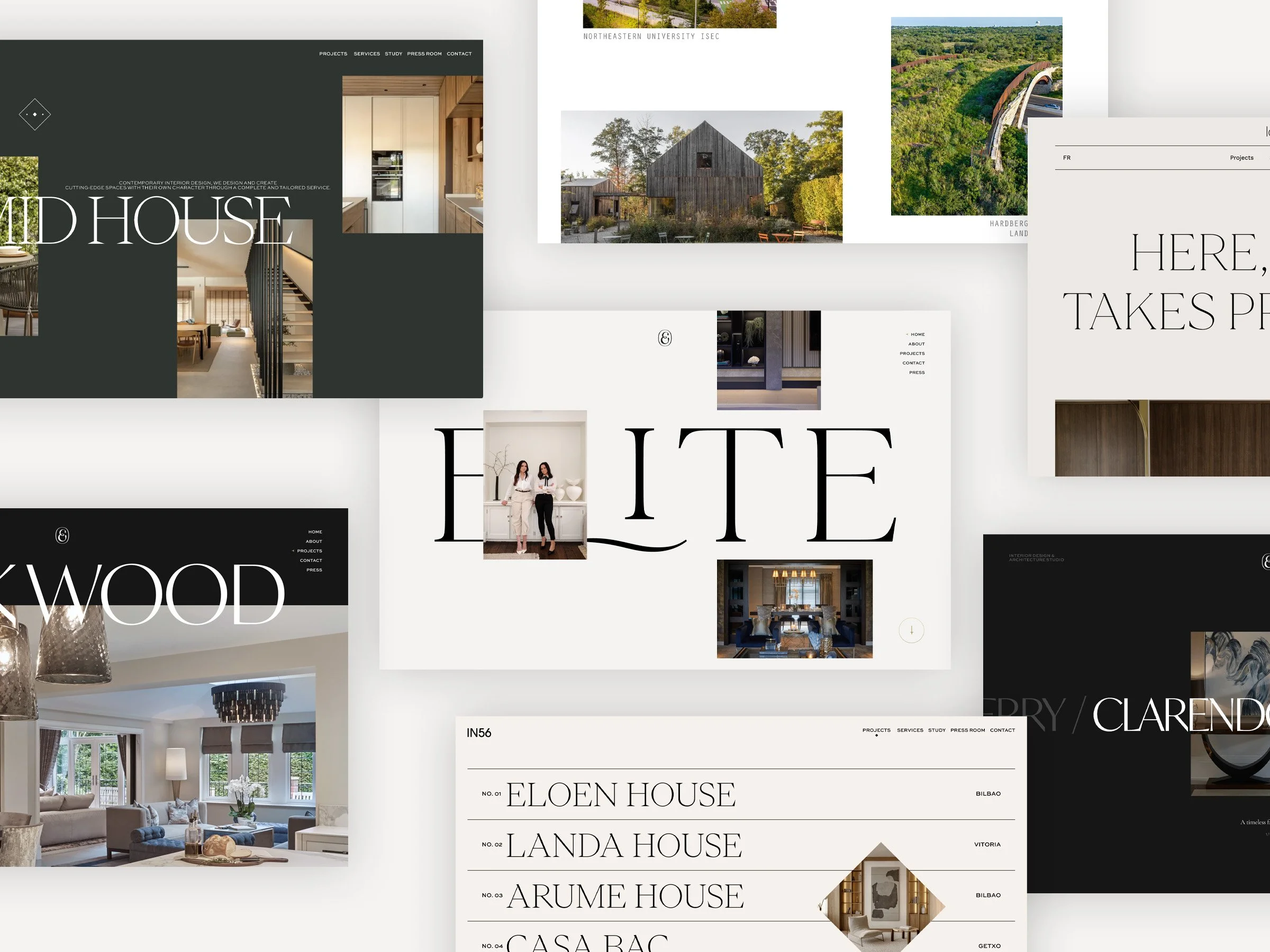
Visual inspiration sourced from architects and designers in adjacent industries
I observed how these websites presented their work visually with unique layouts that reflect their artistic and creative capabilities. Bold typography paired with immersive visuals and subtle motion effects began to inform the new site strategy.
Exploring Solutions
Given the project-based nature of their work, a well-integrated Project Gallery made sense as the primary vehicle for highlighting Sperry’s products. I began sketching design variations on the whiteboard before continuing to ideate with low fidelity wireframes, exploring how best to reflect their work and engage their audience.
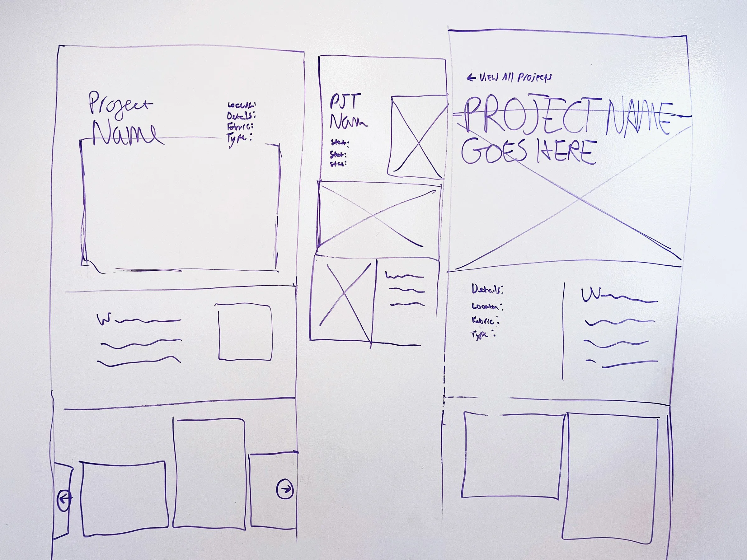
Whiteboard explorations for project gallery post page
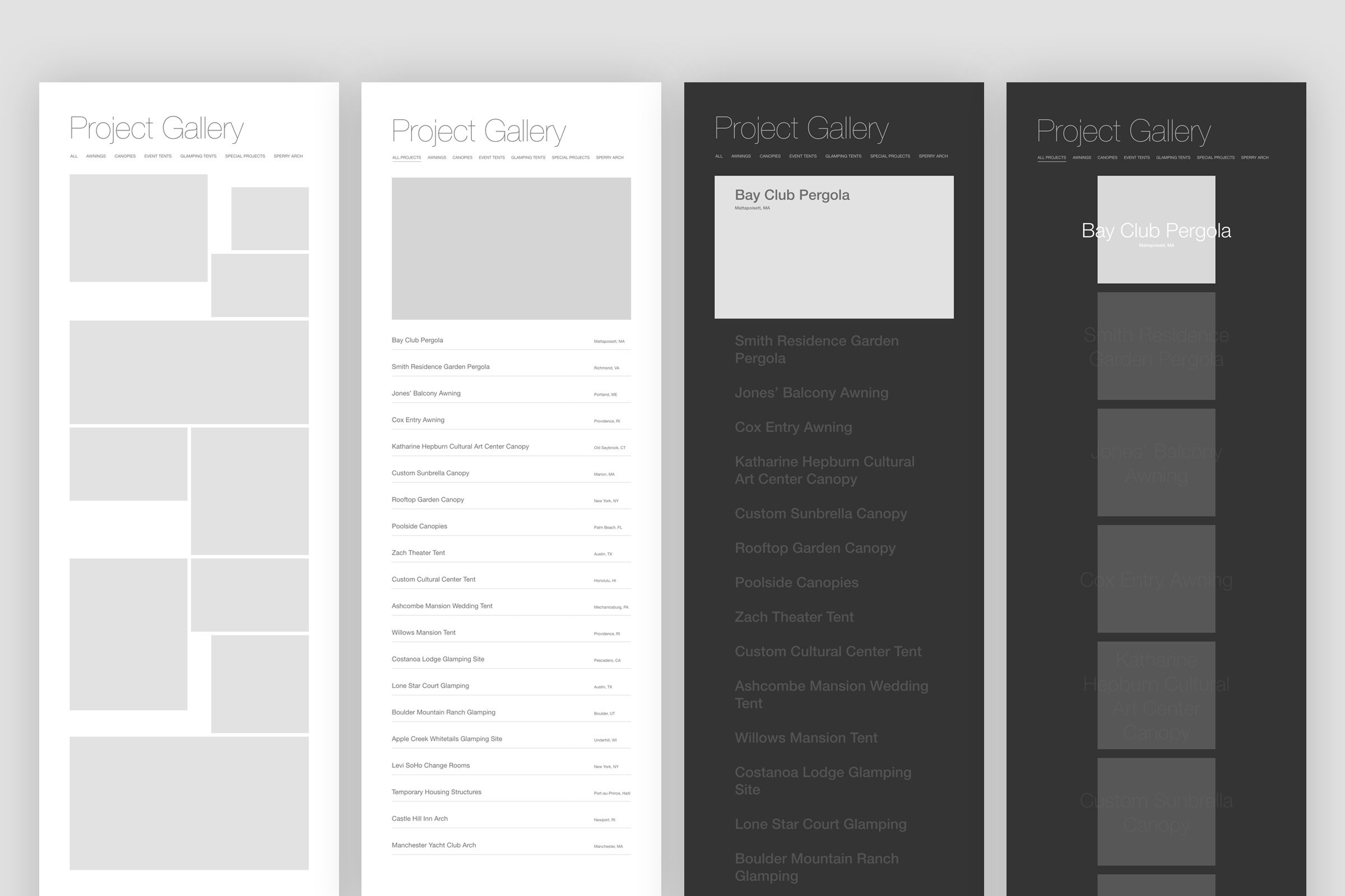
Layout variations explored for the project gallery archive page
Of the four variations pictured above, I found the last (which utilized a dark background, squared images, and overlapping titles) to be the most visually compelling and relevant for showcasing Sperry’s work. I further refined this version and created wireframes for the gallery post page and all other core page types.
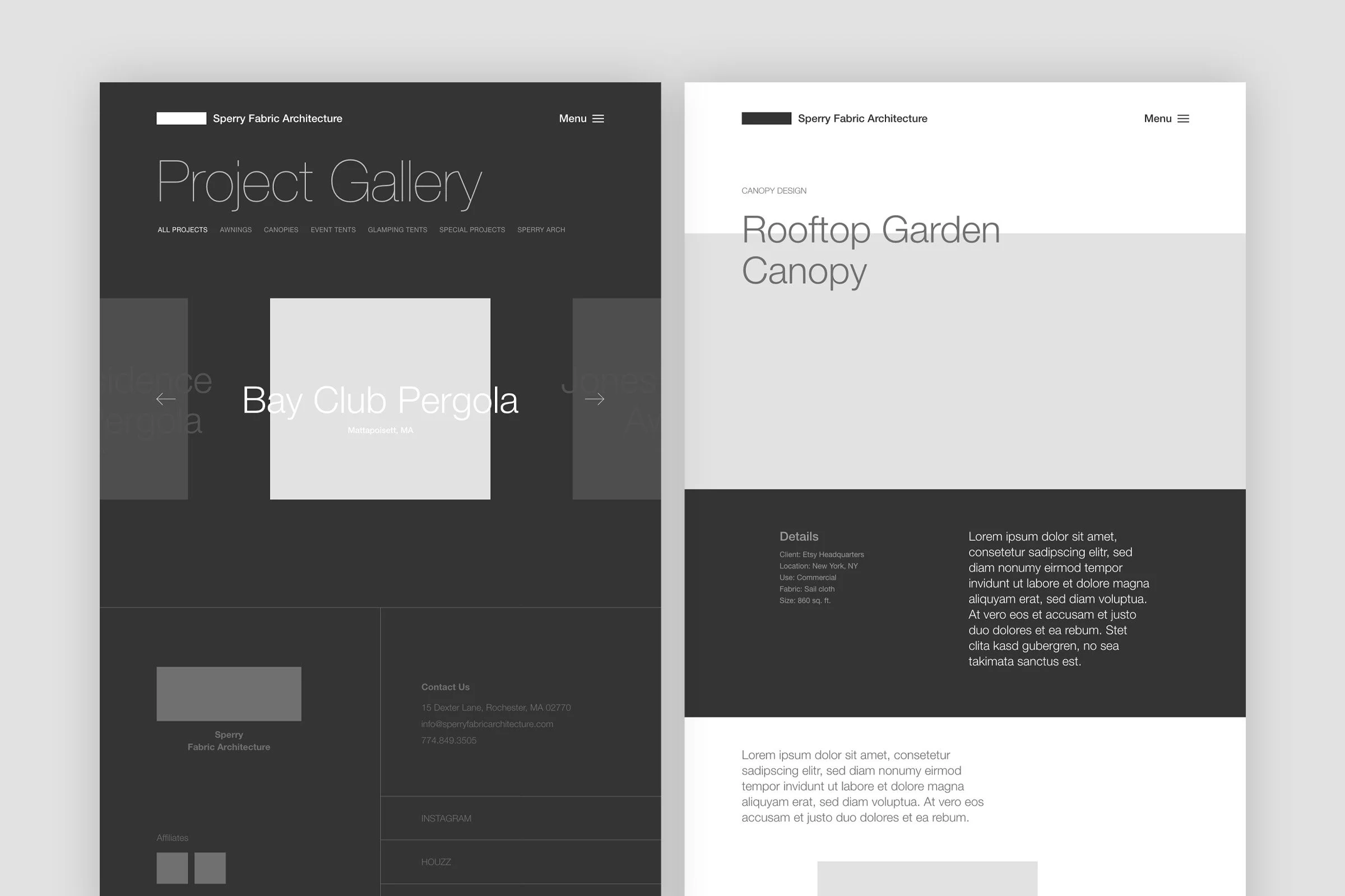
Refined layouts for gallery archive and gallery post pages
Correcting Course
After further building the Project Gallery layout in the mockup phase, I solicited feedback from a focus group which uncovered the following concerns:
The content carousel approach felt cumbersome to navigate given the volume of gallery projects
The dark background of the page felt oppressive, swallowing attention from the project images themselves which the design was meant to enhance.
I revised the layout, creating a smaller collection of featured projects that would utilize the carousel layout while the full project list would live inside a more space-efficient list structure.
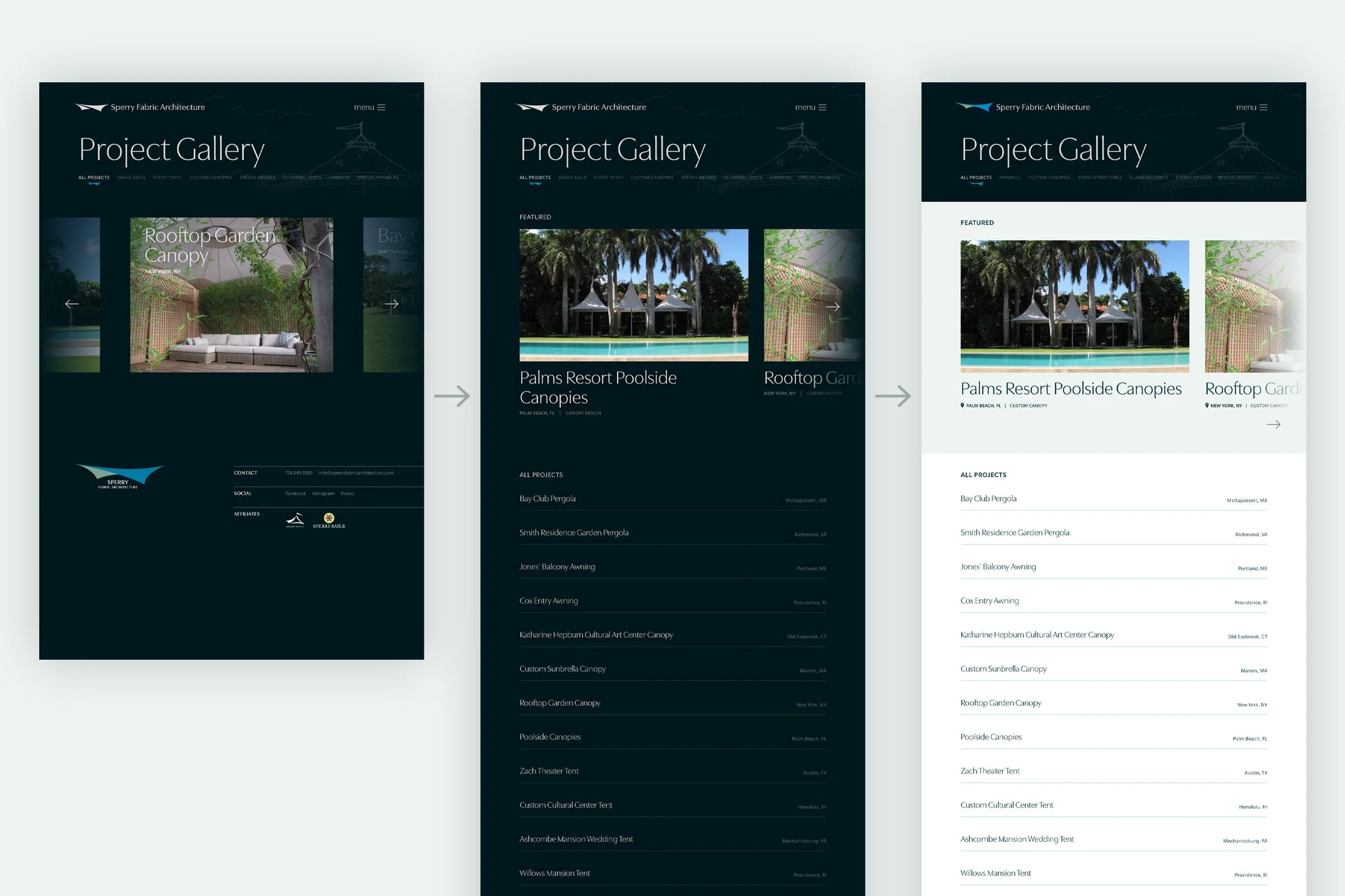
Creating separate project groups and reducing the usage of dark backgrounds alleviated scroll fatigue and enhanced content hierarchy.
Visual Design Details
Through iteration and refinement, key aspects of the site’s visual design were crafted to mirror the custom nature of Sperry’s products and the inspiring feeling they create.
Expanded Menu Reveal
One of Sperry’s architectural sketches was leveraged as a textural element in the header, infusing the site with the custom designed nature of their process. As the menu is expanded, the remaining portion of the sketch is revealed, creating a moment of completion.
Expanded menu completes reveal of hidden product illustration
Brandmark Tab Indicator
Sperry’s brandmark was utilized to indicate the active page of the Project Gallery as well as the Product Directory. This customized detail helps the site feel distinctly Sperry.
Branded element for indicating active tab
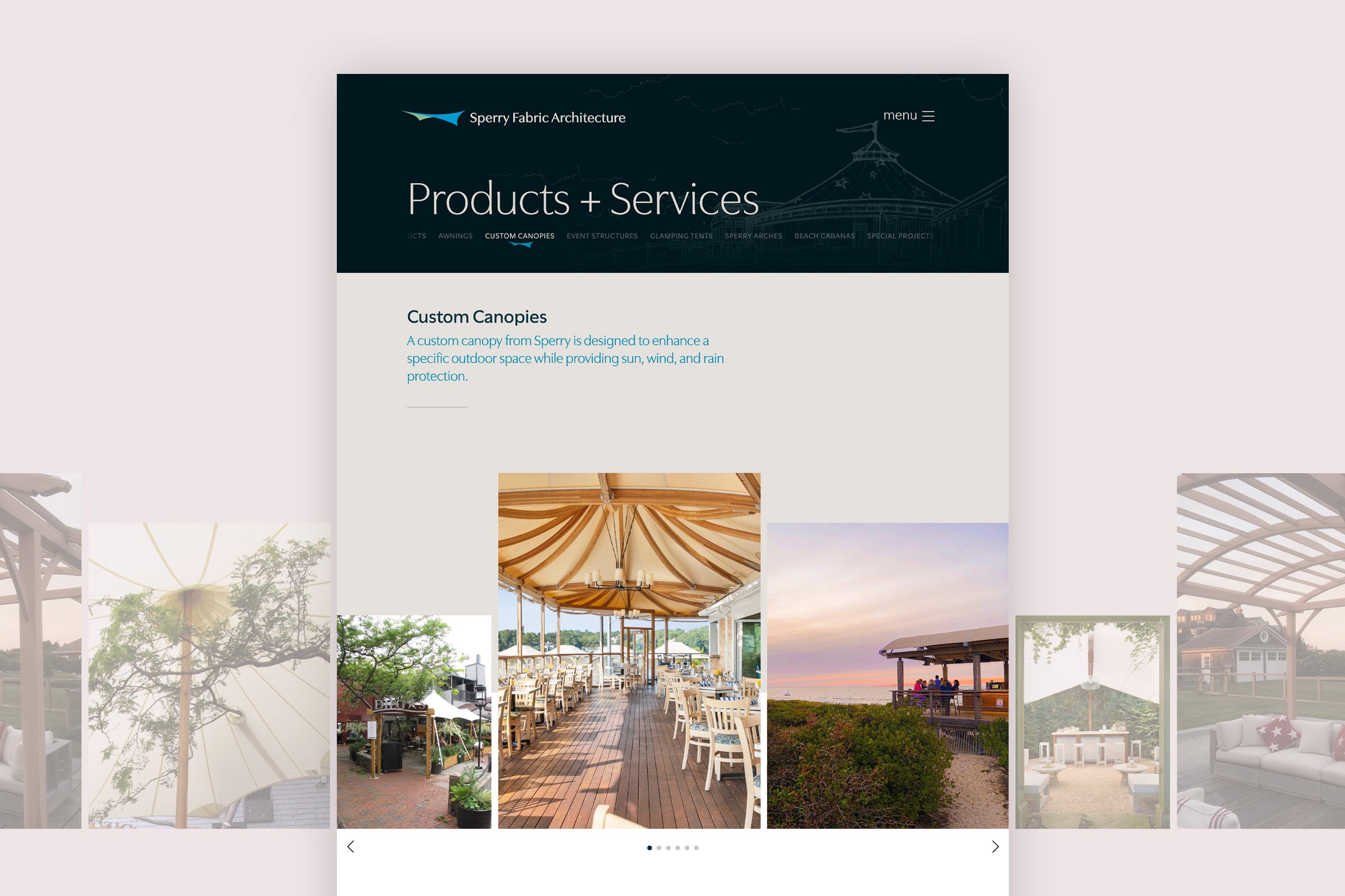
Custom Gallery Carousel
Each product and gallery page needed to house dozens of images. Rather than placing them in a rigid grid, I created a repeating sequence of image containers using various sizes and dimensions. This created an organic and varied gallery feeling for the viewer while also minimizing upload effort for site editors.
Gallery carousel leverages varied container dimensions to enhance visual interest of layout.
Final Effect
Through a refined content strategy and artistic layout, Sperry Fabric Architecture’s new website brings clarity to their product offerings and better showcases their capabilities.
Current form submission data shows strong year-over-year inquiries with consistent peaks each spring and summer. Over 55% of form submissions are coming from referral and direct search, indicating the kind of informed, higher-intent client Sperry was hoping to attract.
Without baseline analytics from before the redesign, we couldn’t precisely quantify the site’s improvement. However, the consistency of inbound leads since launch, combined with the client's satisfaction with the new site, points to a positive outcome.
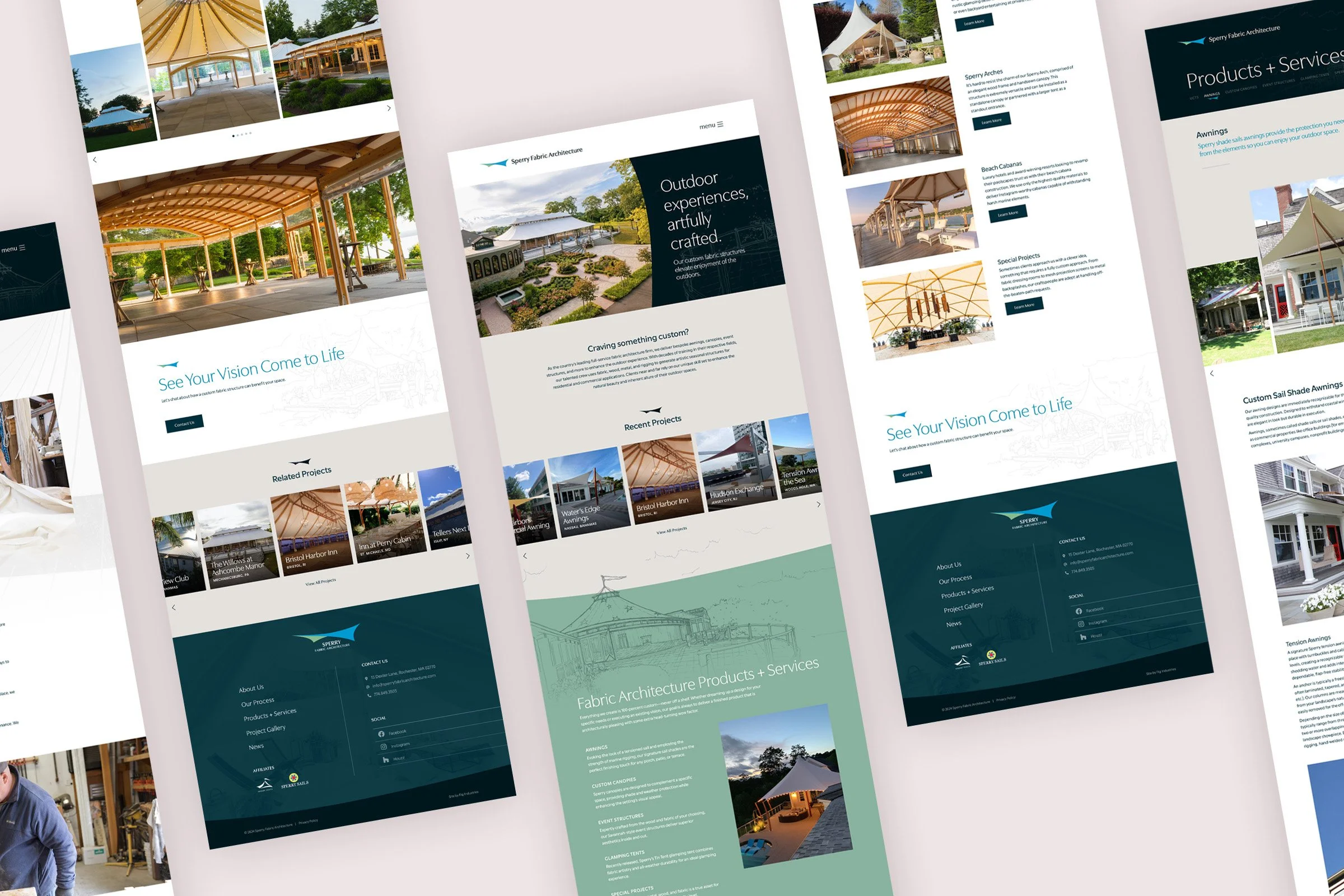
Project Reflections
Looking back, the visual design of this site could have been pushed, perhaps by implementing a splashier home page graphic or animation. We could have also created a better metrics-based way of measuring success. Despite those points, the project successfully transformed Sperry's digital presence into one that better reflects the craftsmanship of their work and continues to generate the type of inquiries the business was aiming to attract.
This project was completed while employed by Fig Industries, a creative agency in Lancaster, PA.