My Project Role: Senior designer/project lead, leading UX strategy, research, information architecture, design system development, and cross-functional collaboration.
Full Project Team: Founder/CEO, managing editor/product owner, location directors and editors, graphic designer/illustrator, full stack developer
Methods Used: Stakeholder interviews, platform audit, quantitative research, competitive analysis, cost-benefit analysis, wireframing, design system, mockups, user testing
Project Duration: 15 months
Identifying The Challenges
Fig’s existing web platform was largely designed to accommodate its print publication. And while it served their needs for many years, the publication strategy had since evolved and the business had expanded to more locations. The platform’s design and technical configurations were limiting content access and creating roadblocks to scaling Fig’s presence.
Defining Objectives & Goals
I began by leading stakeholder interviews and an in-depth audit of the existing platform to uncover the most pressing issues. These insights guided our team towards defining project objectives which included:
Creating an architectural separation between the parent site and each franchised location site
Giving editors the right level of access to manage their sites
Adjusting the design system and core page templates to better accommodate current and future content strategies
Increasing site readership and core product subscriptions, in turn increasing value to advertising partners
A Deeper Dive
Data Analysis
To better understand platform performance and user engagement, I analyzed 10 years of web data, identifying year-over-year changes and trends in page views, site users, pages per session, session duration, and user acquisition.
It surprised the whole team to see the data showed a steady, sustained decline across many key metrics including site users and page viewership. However, it was difficult to decipher if this was caused by the relevance of the site contents, the functionality of the site’s design, or other external factors.
Digging deeper into user acquisition revealed nearly 50% of site traffic coming from organic search yet several of the top-performing pages were outdated posts that had never been retired.
These findings helped shape three new priorities going forward: building a more intentional content strategy; modifying the site design to increase engagement; and establishing feasible, trackable goals with routine performance monitoring going forward.
Competitive Analysis
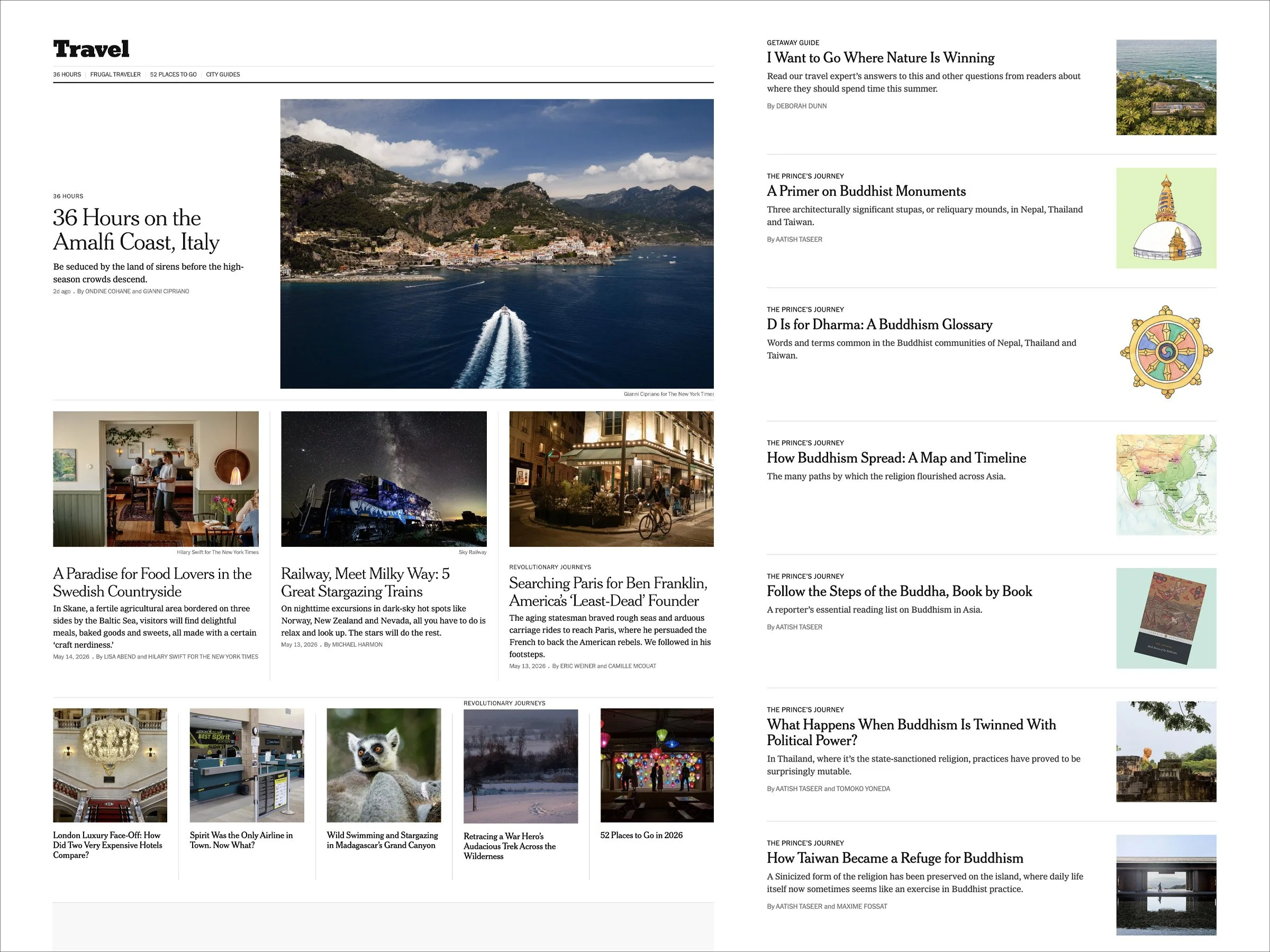
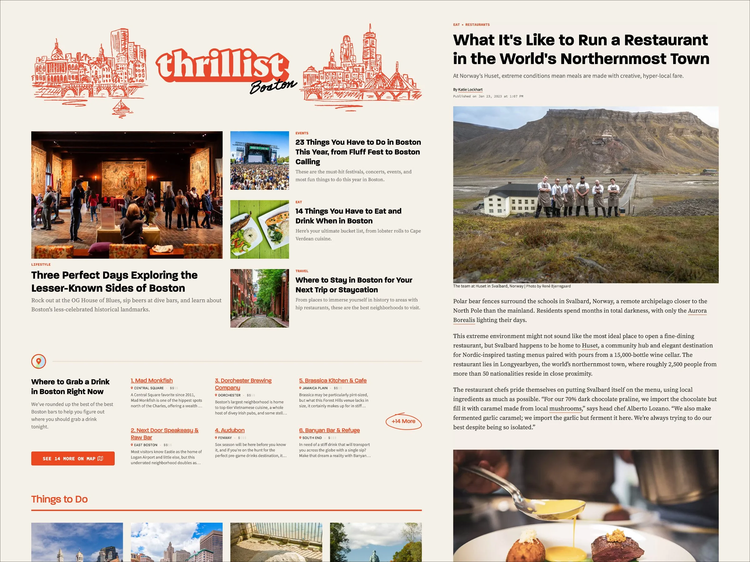
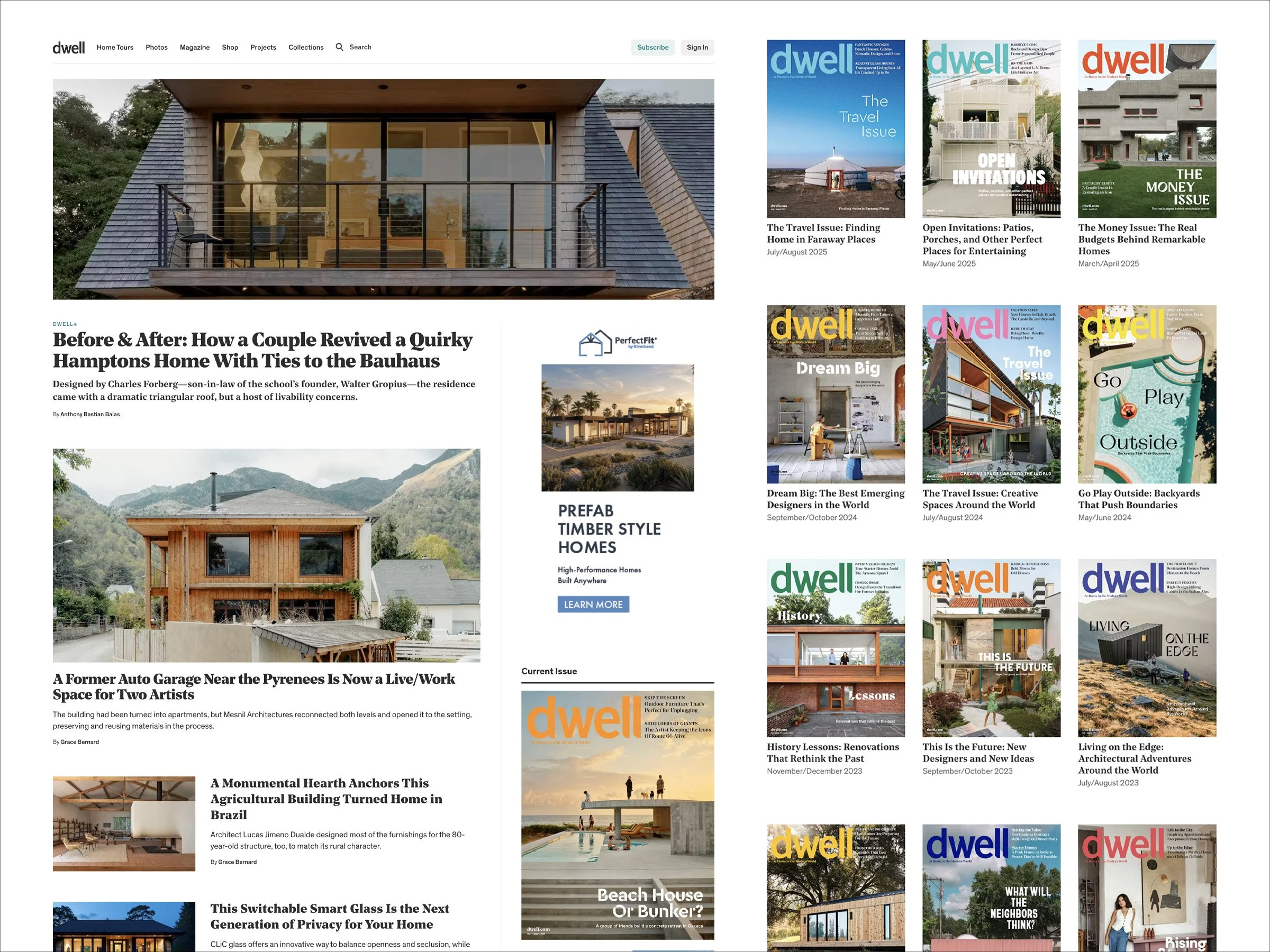
With few direct competitors to benchmark against, I turned to legacy publishers (Wired, Lonely Planet, The New York Times) and digital-native publishers (Brit+Co, Thrillist) to study how mature content organizations structure their sites.
I observed that these sites leveraged topical navigation structures as well as topic-based article groupings and collections. I also noted the volume of content on these sites’ landing pages was significantly greater than what Fig was utilizing.
These insights informed the direction of the redesign, guiding us to increase the volume, variety, and organization of content on landing pages as well as introduce a topic-based navigation structure.
I was also curious to review the subscription models of streaming services like Peacock, Netflix, and HBO Max. Even though these were not direct competitors, I wanted to understand how they used tiering and value-proposition messaging to convert visitors into subscribers. This informed my recommendations to leadership for how Fig’s new print subscription offerings could be structured.
Comparing Approaches, Guiding Direction
With the insights gained from this research, my focus shifted to the more tangible question: How do we get from A to B? Two paths presented themselves for how we could bring the new vision to life.
The first approach involved making alterations within the existing infrastructure. Maintaining the bones of what was already established would allow for fast implementation while also keeping costs low. However, it was unclear whether investing in the existing infrastructure was the best use of resources.
The second approach involved rebuilding the site network from the ground up. A “fresh start” approach of this nature would require more time and financial resources but would provide a blank canvas to dream bigger.
At this point, the project reached a crossroads. To help make an objective decision, I led a cost-benefit analysis, outlining requirements and exploring the financial and non-financial implications that may impact outcomes. This guided the team towards choosing a ground up rebuild, allowing Fig to be better configured for future growth initiatives.
Exploring Form & Function
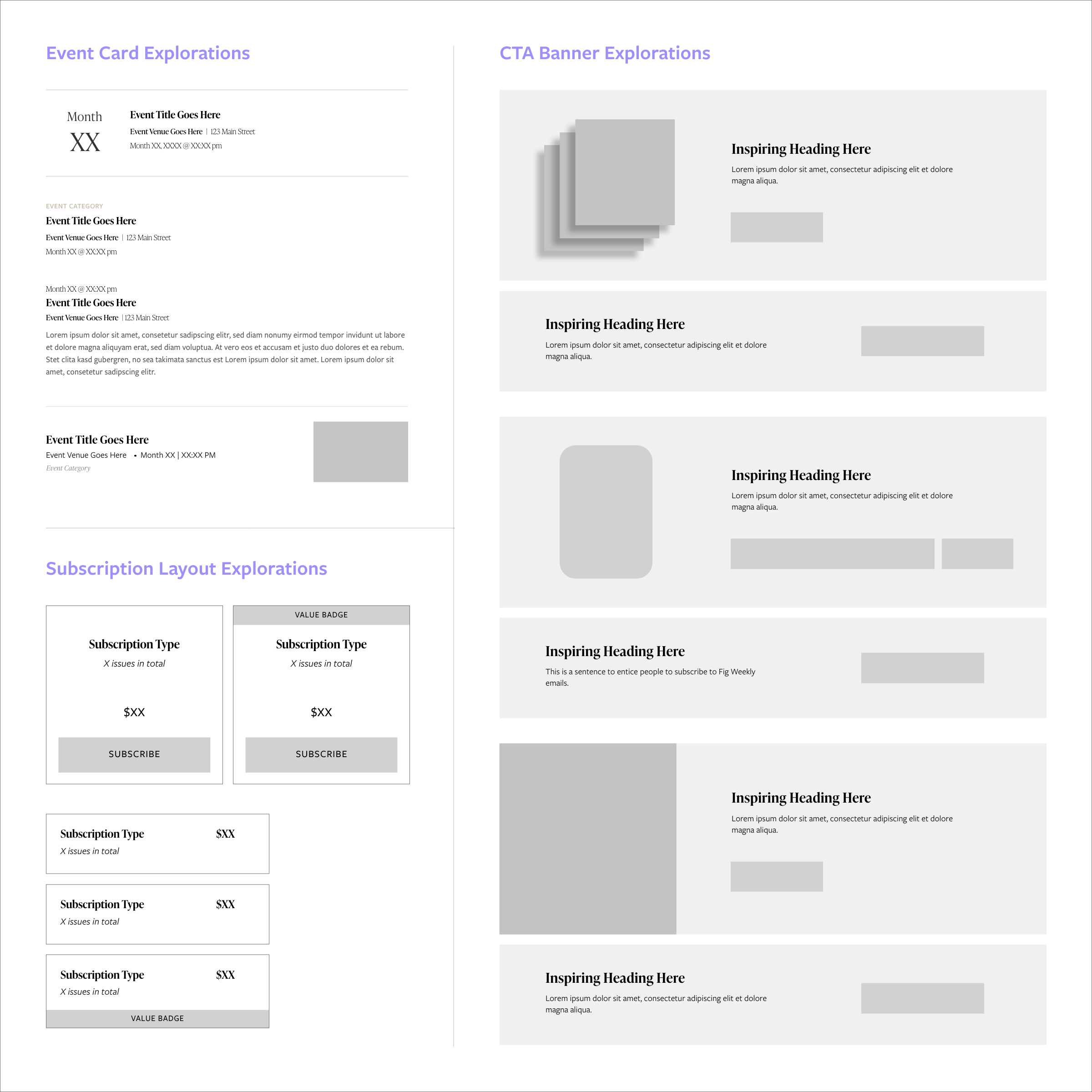
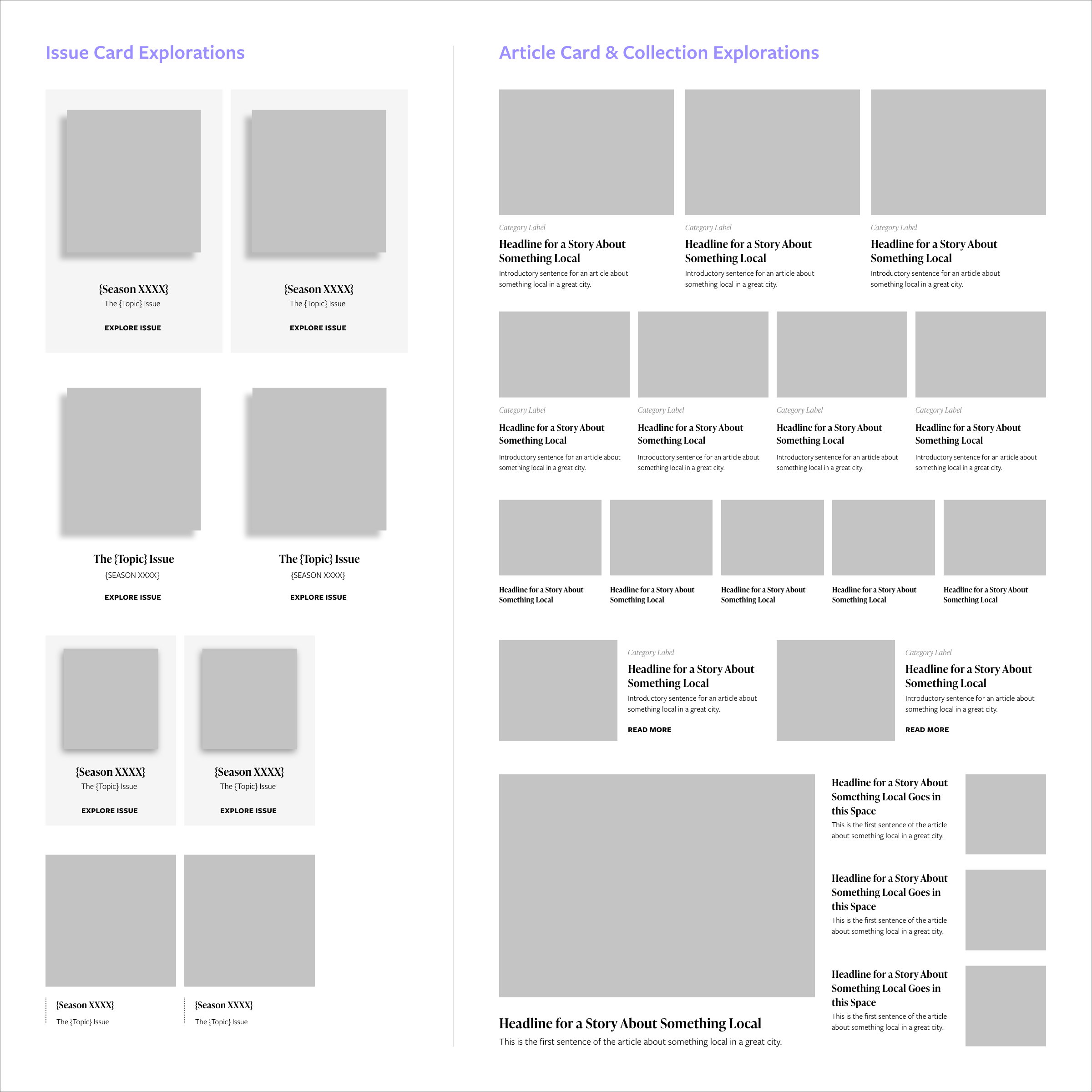
My next priority was determining how to organize and present the site's growing volume of content. Rather than diving directly into page layout design, I first explored ways of displaying core content blocks that could be implemented independently of any one page or site.
Building Blocks
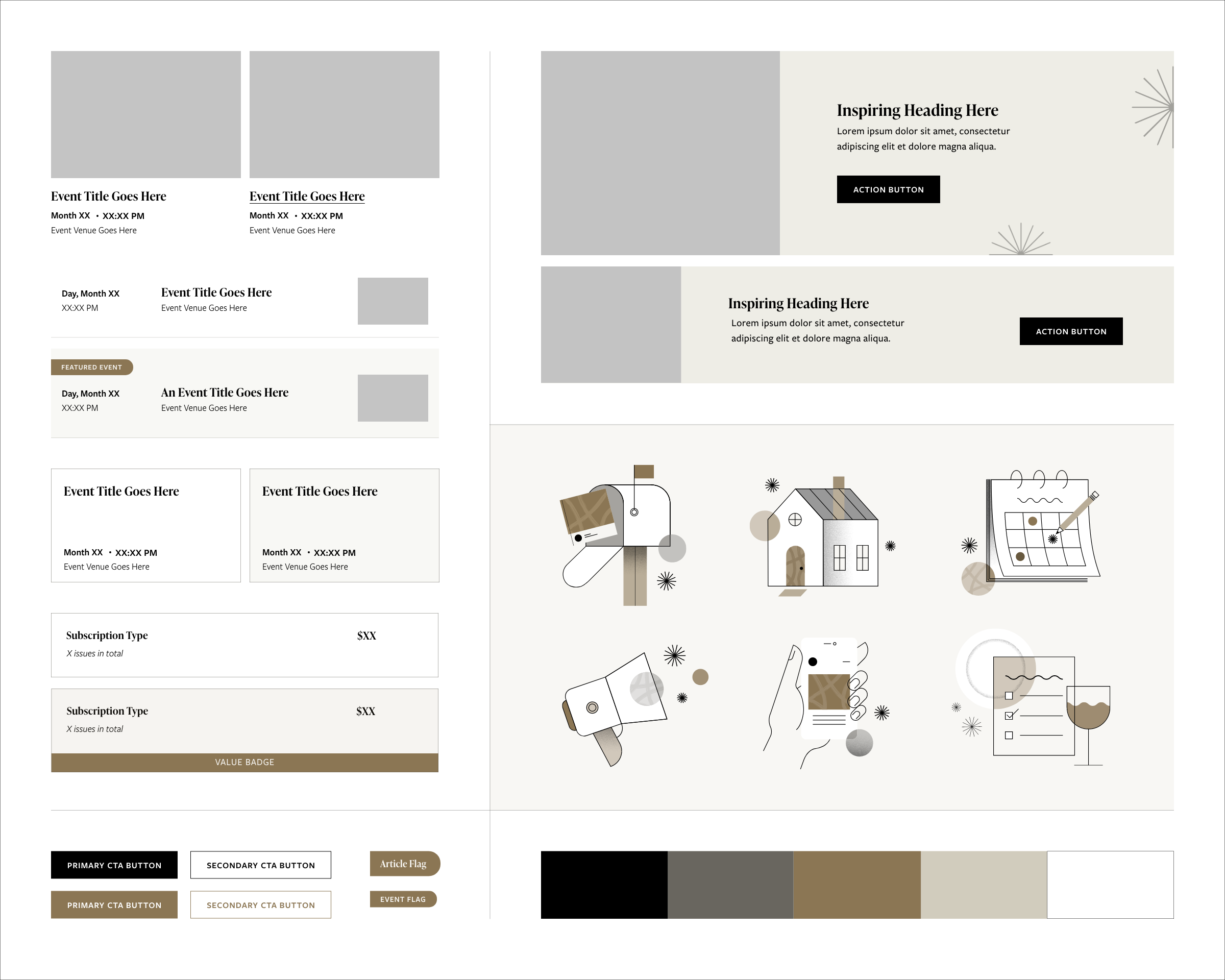
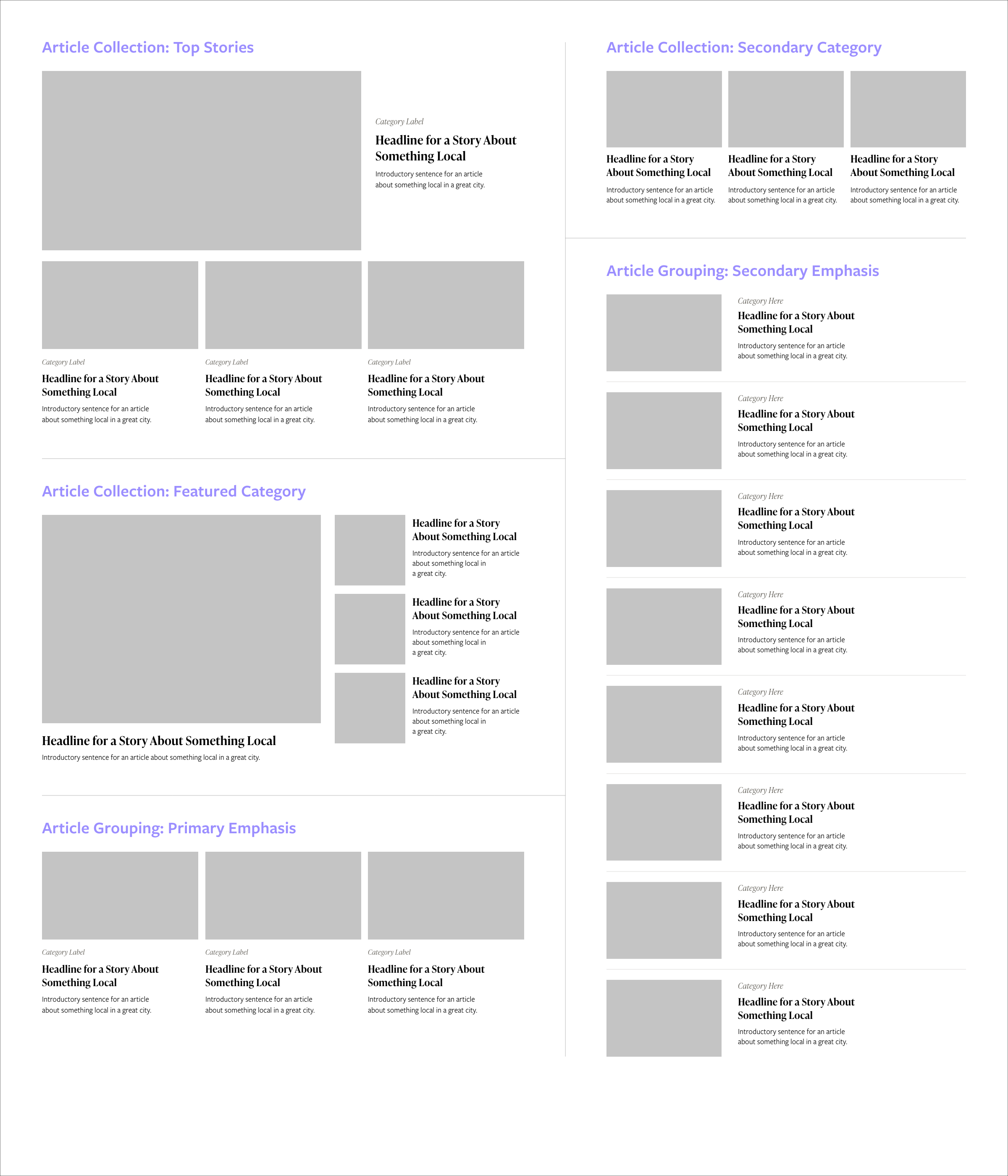
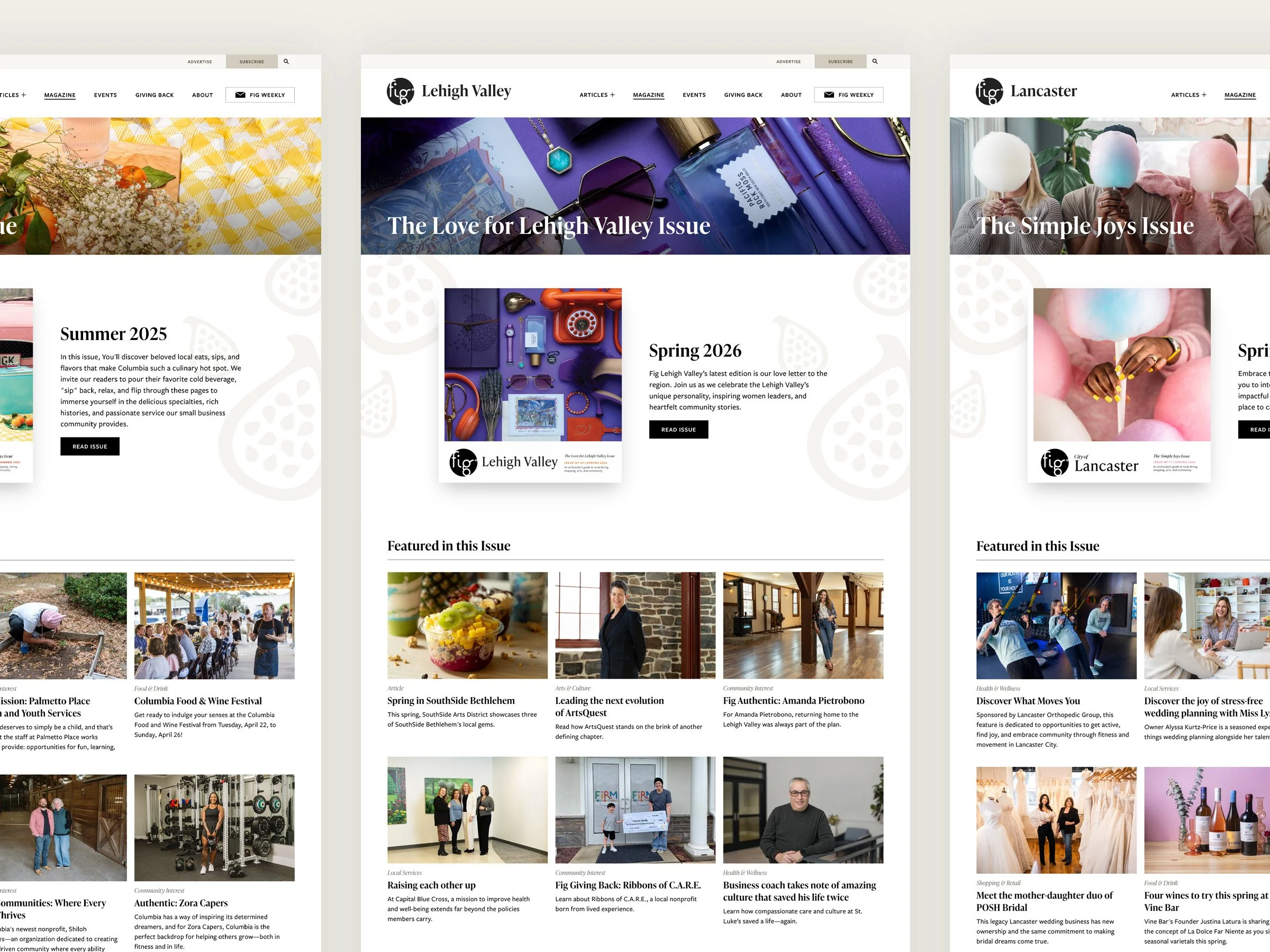
The components that would be utilized the most across the site network included article posts, event listings, and issues directories as well as blocks for core functions such as CTAs and subscription choices. For each, I designed multiple variations to test content hierarchy, information density, and performance within repeated grids.
This process helped surface the best versions of each component that could then be used to generate sample page layouts.
Building Layouts
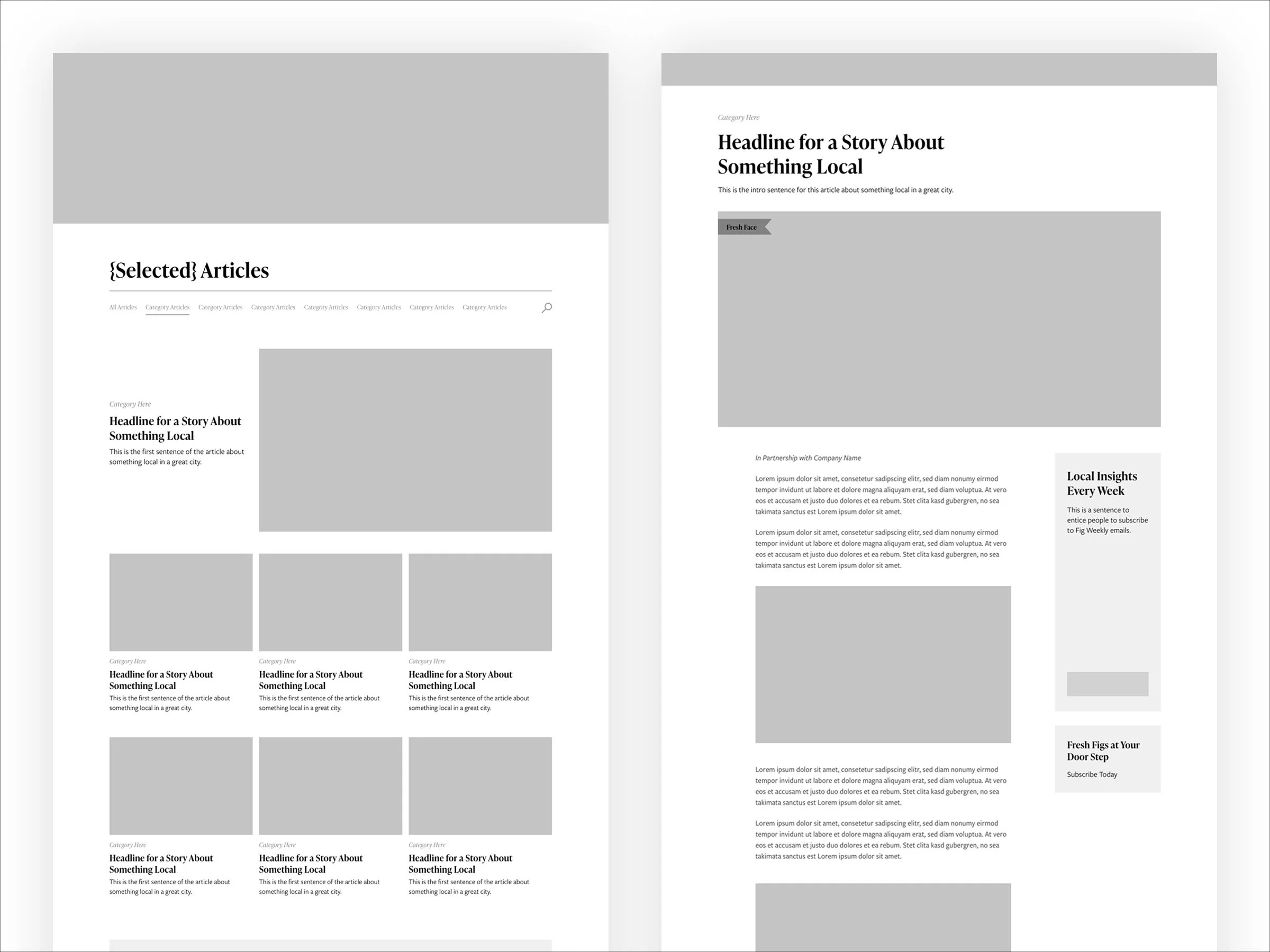
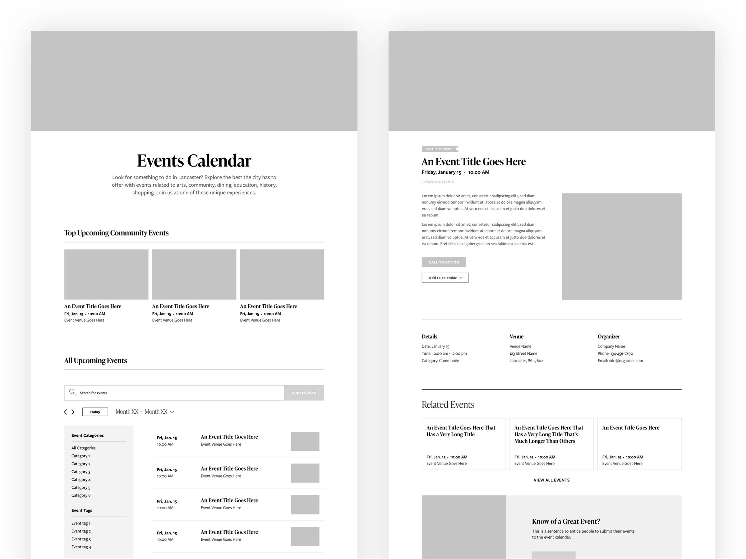
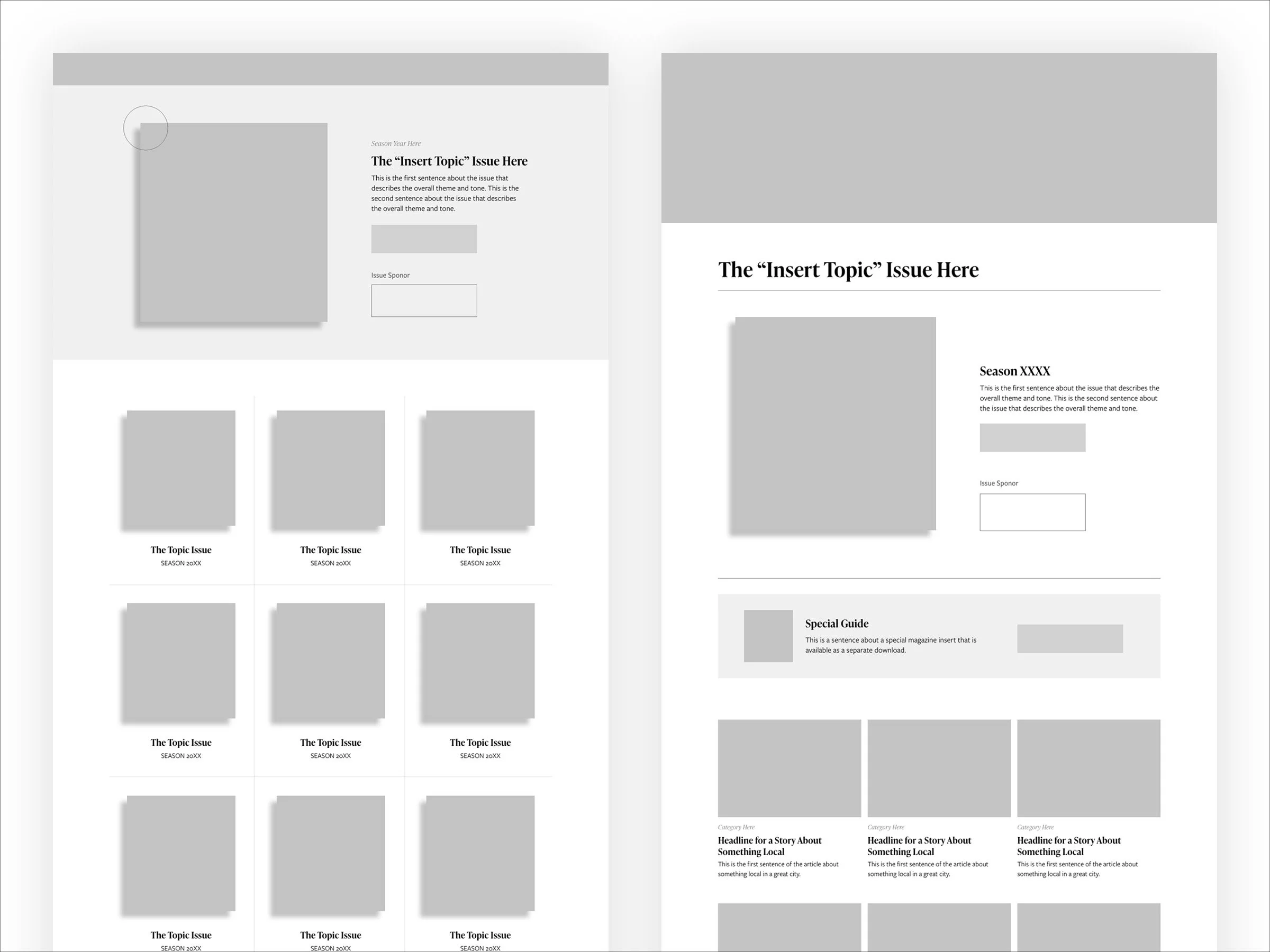
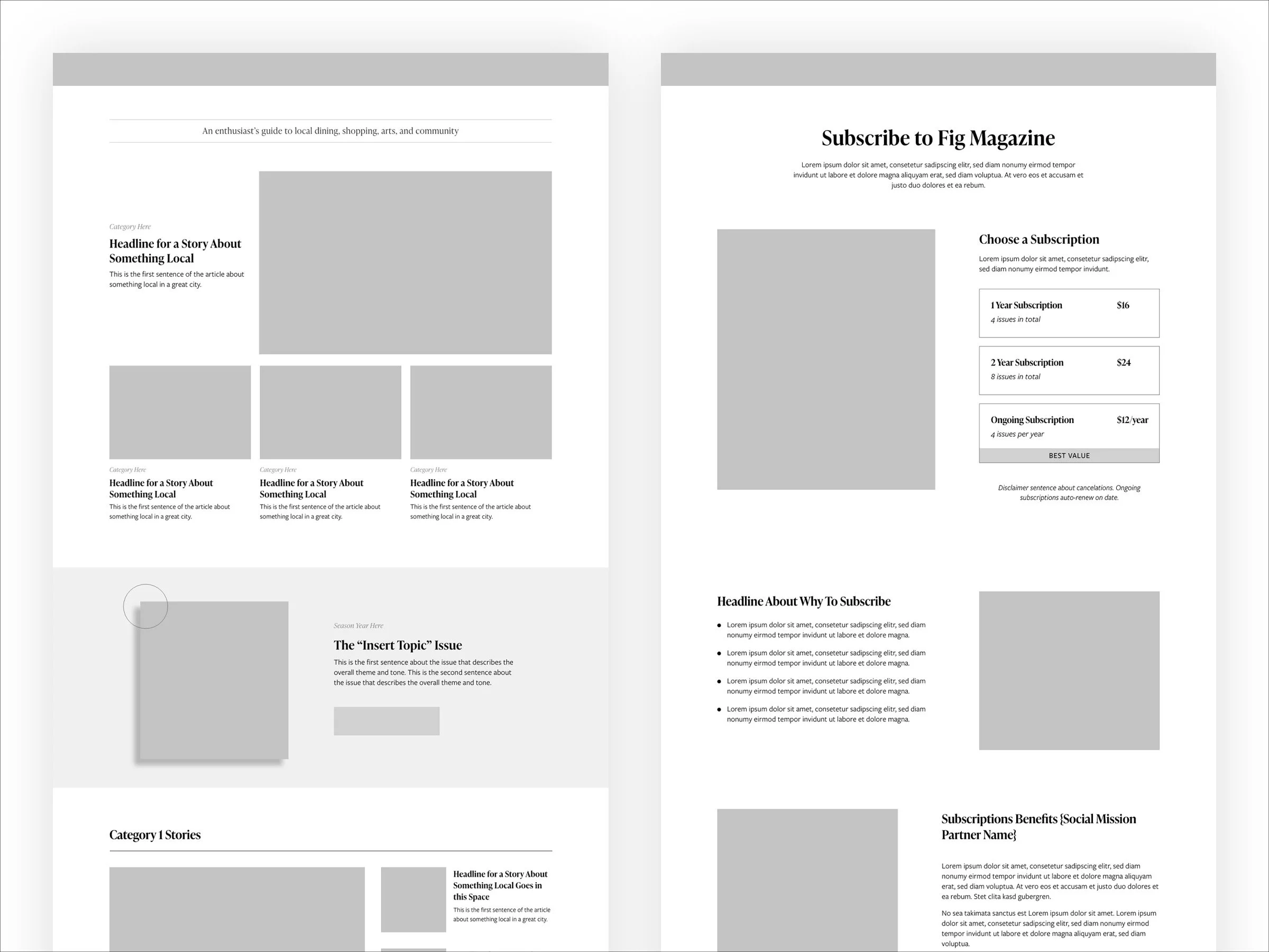
Once the strongest design system variants were identified, I created full page layouts for each key page type and continued testing internally, revealing how well the components performed together across a range of content scenarios.
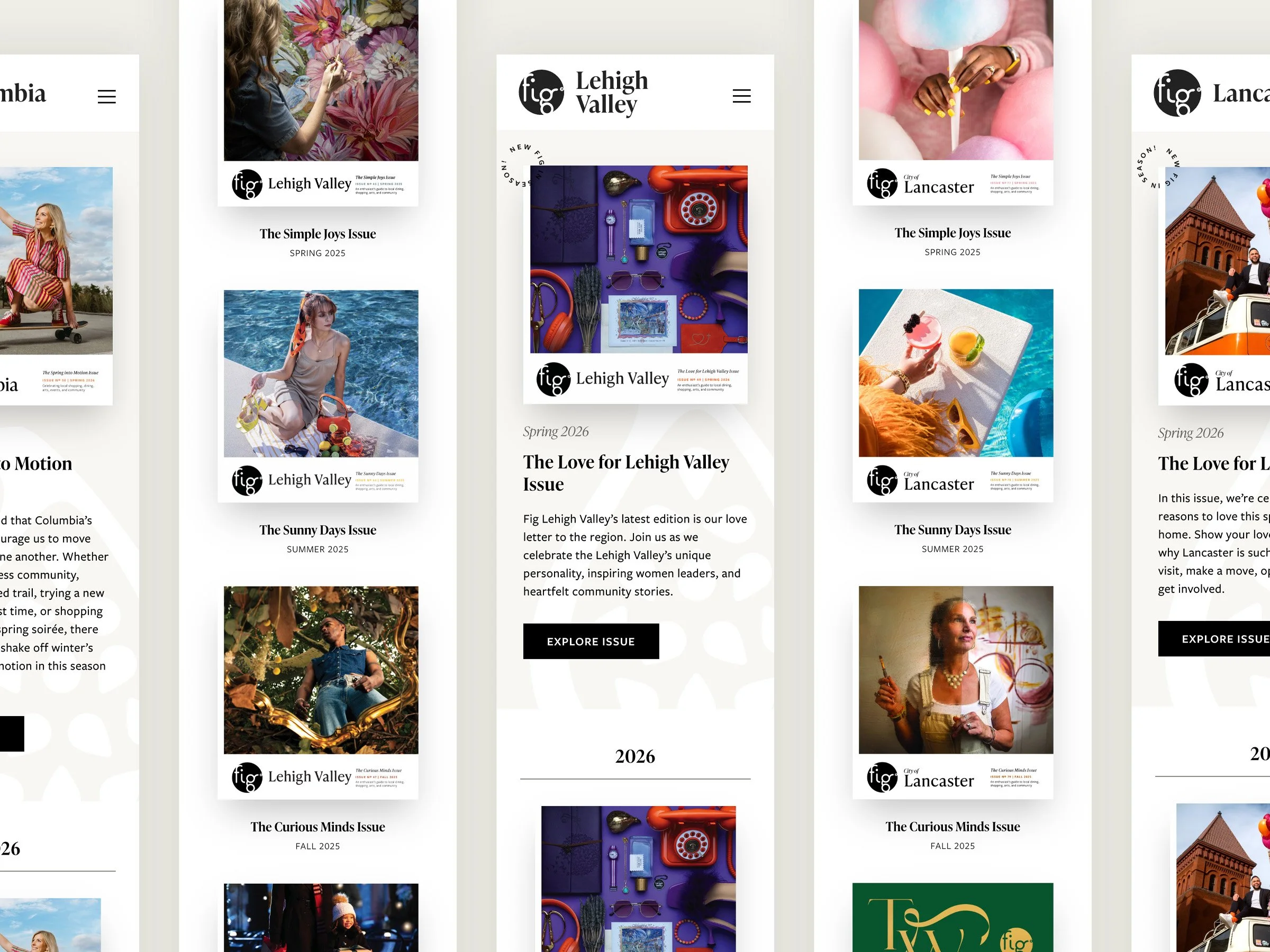
After refining the best combinations, I arrived at a deliberate, smaller set of layout templates for the final design system.
Visual Design Philosophy
Fig’s mission is to showcase and celebrate the brands and businesses that make each city unique. This mission is reflected in their visual design philosophy which leverages a neutral color palette and subtle typefaces, allowing the spotlight to shine more brightly on the community businesses they champion, rather than themselves.
So the next challenge was implementing the right balance of colors, typefaces, and graphic elements, creating visual hierarchy that guides users without overpowering site contents.
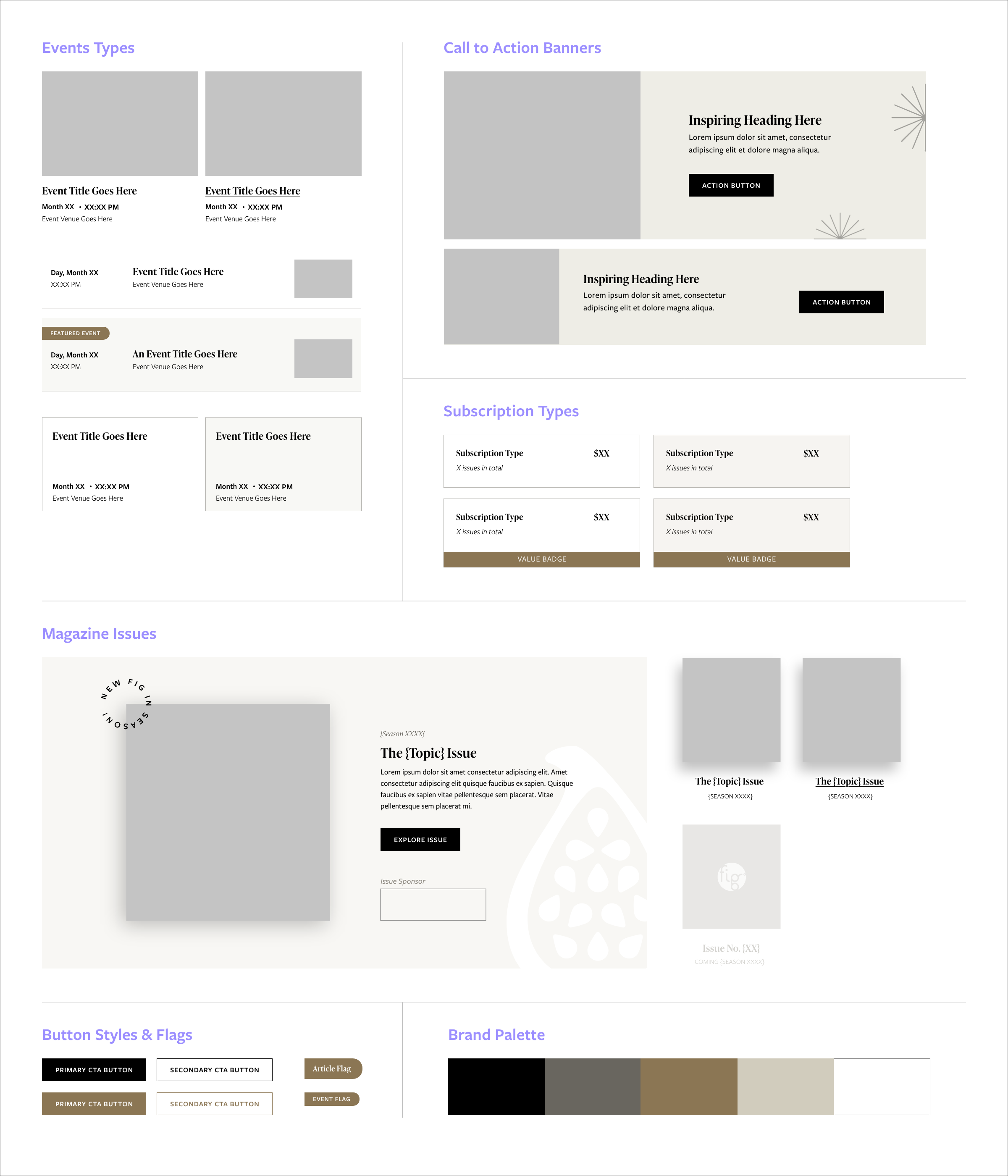
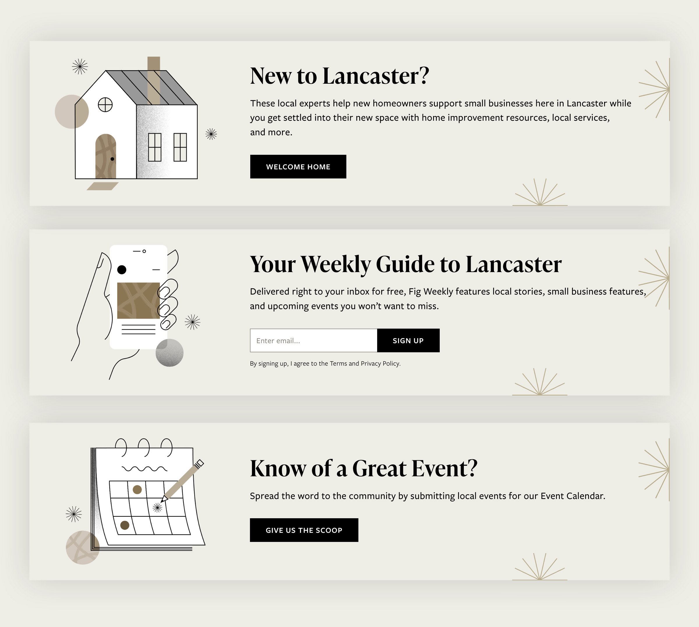
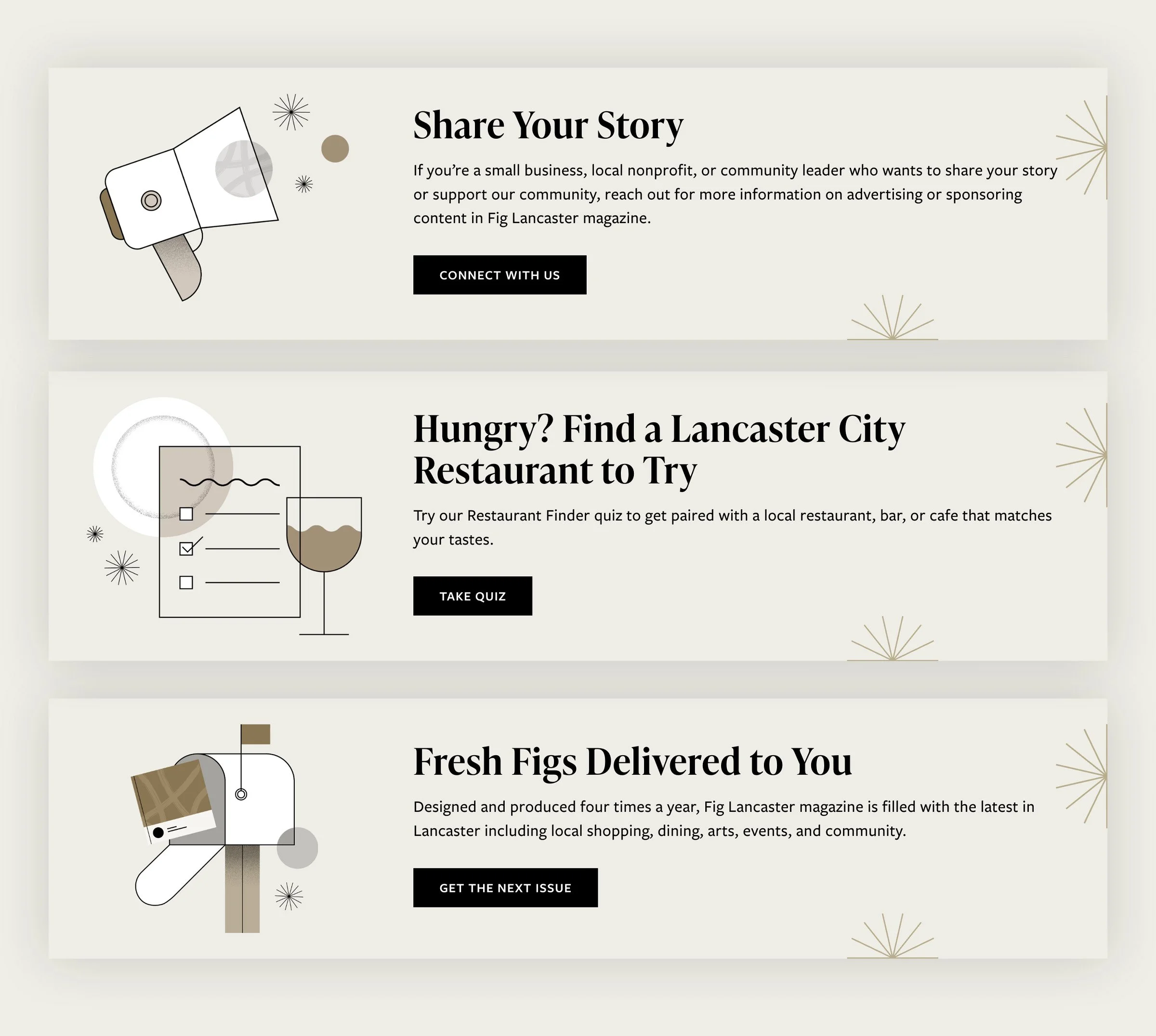
A key area where Fig’s personality could shine was the call-to-action sections. I chose to highlight key actions with custom illustrations using a vibrant, playful style and Fig’s signature color palette. Using an illustrative approach here created a helpful visual distinction between the CTAs and the photo-heavy article groupings found on most pages.
Correcting Course
After launch, the team discovered the community calendar submission form was creating confusion and displaying unclear error messages.
This form was built by a third-party service provider and synced directly with the calendar management system. The benefit of this configuration was it allowed event submissions to be reviewed by editors and then seamlessly published.
However, the frustrations experienced by form submitters were outweighing this operational simplicity. And without the ability to modify the existing form, we had to pursue an alternative solution.
Switching to another service provider altogether would have been ideal in theory, but costly and time-consuming. Instead, I brainstormed with the development team to see how, within the existing infrastructure, we could give form users a better experience while not creating a work-flow bottleneck for site editors.
Together we arrived at a custom submission form that could sync the majority of the form data into the existing calendar management system. The tradeoffs included upfront development costs and extra (but minor) workflow steps for site editors. However, these factors were outweighed by the benefit of having a seamless and error-free submission form for the public.
In hindsight, this is something I should have tested more rigorously before launch to avoid needing to course correct later.
A Shared Success
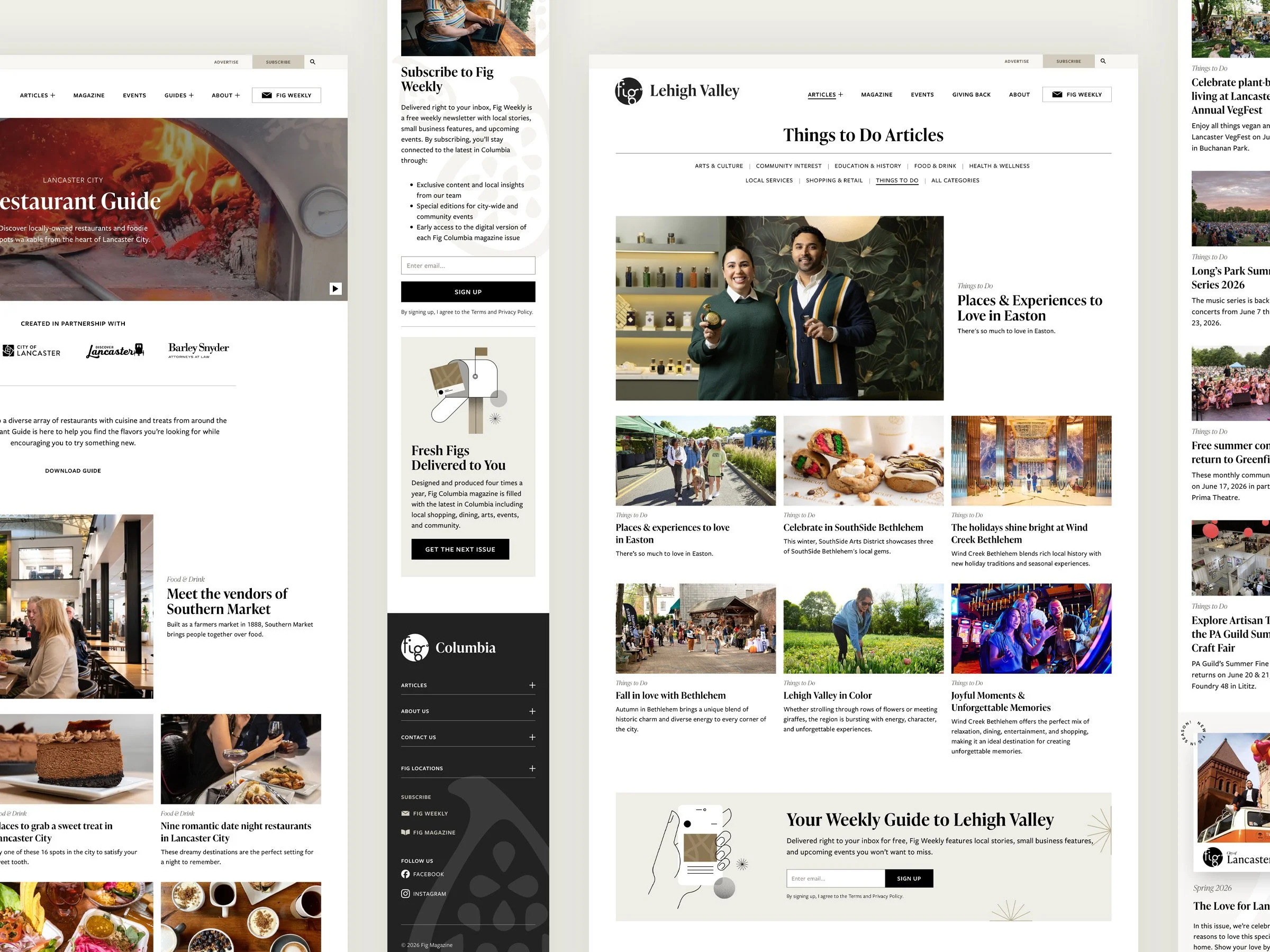
The success of the new platform was a result of shared efforts between the design, content, and marketing teams. In the 12 months following relaunch we observed the following:
76% increase in site users
98% increase in total page views with a 72% increase in article page views
16% increase in pages per session
98% increase in digital newsletter subscriptions
Additional Wins
The parent site of the new network was configured using a separate, location neutral domain. This created the structural distinction Fig needed and streamlined the process for adding new sites.
Three unique editor roles were created and defined, allowing Fig to better grant and manage access to their sites.
Leveraging the existing design system, the team was able to efficiently create new location guide pages for dining and retail as well as splash pages for new locations.
Looking Back
While creating a robust design system was well-intended, the multiple variations of article blocks and collection groups created a heavy development lift to build. It remains unclear if the benefits were worth the effort. In hindsight, it would have been wiser to start with fewer variations that could have been utilized for more purposes, adding others as needed in the future.
I was honored to work with a great team on this project. By aligning strategies for architecture, content, and UX, we created a platform that not only improved engagement but gave Fig a foundation for continued growth.
This project was completed while employed by Fig Industries, a creative agency in Lancaster, PA.