Project Team: Senior designer & project lead (me), content writers, front and back-end developers, database specialists, project managers, client team leads, property managers
Methods Used: Stakeholder interviews, platform audit, competitor analysis, site mapping, user flow design, content strategy, design system implementation, design mockups, usability testing, data analysis
Project Duration: 21 months
Gathering Insights
Stakeholder Interviews
To kick off the redesign, I led stakeholder interviews with the High team to uncover pain points, goals, and success criteria for the new web platform.
Stakeholders were quick to flag existing frustrations, covering a range of issues from functionality to content relevance and visual design consistency. However, the most prominent concern that I flagged was the accessibility of available units which was several clicks away on an external site.
Stakeholders also helped define the primary audience as prospective residents, typically college-educated adults in their late 20s to early 60s evaluating cost, location, amenities, and layout. The secondary audience was defined as current residents needing quick access to rent payment and maintenance portals.
Lastly, success was framed around easier navigation, simplified content with a consistent tone of voice, a template that could scale across High's portfolio while preserving each community's individual branding, and an increase in qualified applications.
Audit & Analysis
Building on the insights gained from stakeholders, I next conducted a competitive audit of other residential property websites which helped me better understand the landscape of the industry. Comparing the patterns observed on those sites with High’s existing template informed pages to remove/add, navigation elements to prioritize, and audience messaging.
I followed a similar approach for specific guidance on the available unit search process, first examining High’s existing configuration.
Step one: Select “View Availability,” opening external leasing portal
Step two: Choose between new home search or applicant login
Step three: Enter move-in date and desired number of bedrooms
Step four: Review available units & select “apply”
Step five: Begin application process for selected unit
This volume of steps felt cumbersome. The immediate transition from property site to external portal felt abrupt. Requiring a choice between search vs login felt unnecessary having previously selected to see availability.
With High’s existing framework in mind, I returned to the industry example sites and discovered most were leveraging the following user flow.
Step one: Select View Floor Plans or View Availability
Step two: Review floor plan options and select desired
Step three: Explore details and select “apply” for any available unit
Step four: Begin application process via external leasing portal
By comparison, this process felt frictionless and intuitive. Publishing available units directly on the site allowed for seamless exploration while the third-party handoff at the beginning of the application process seemed understandable.
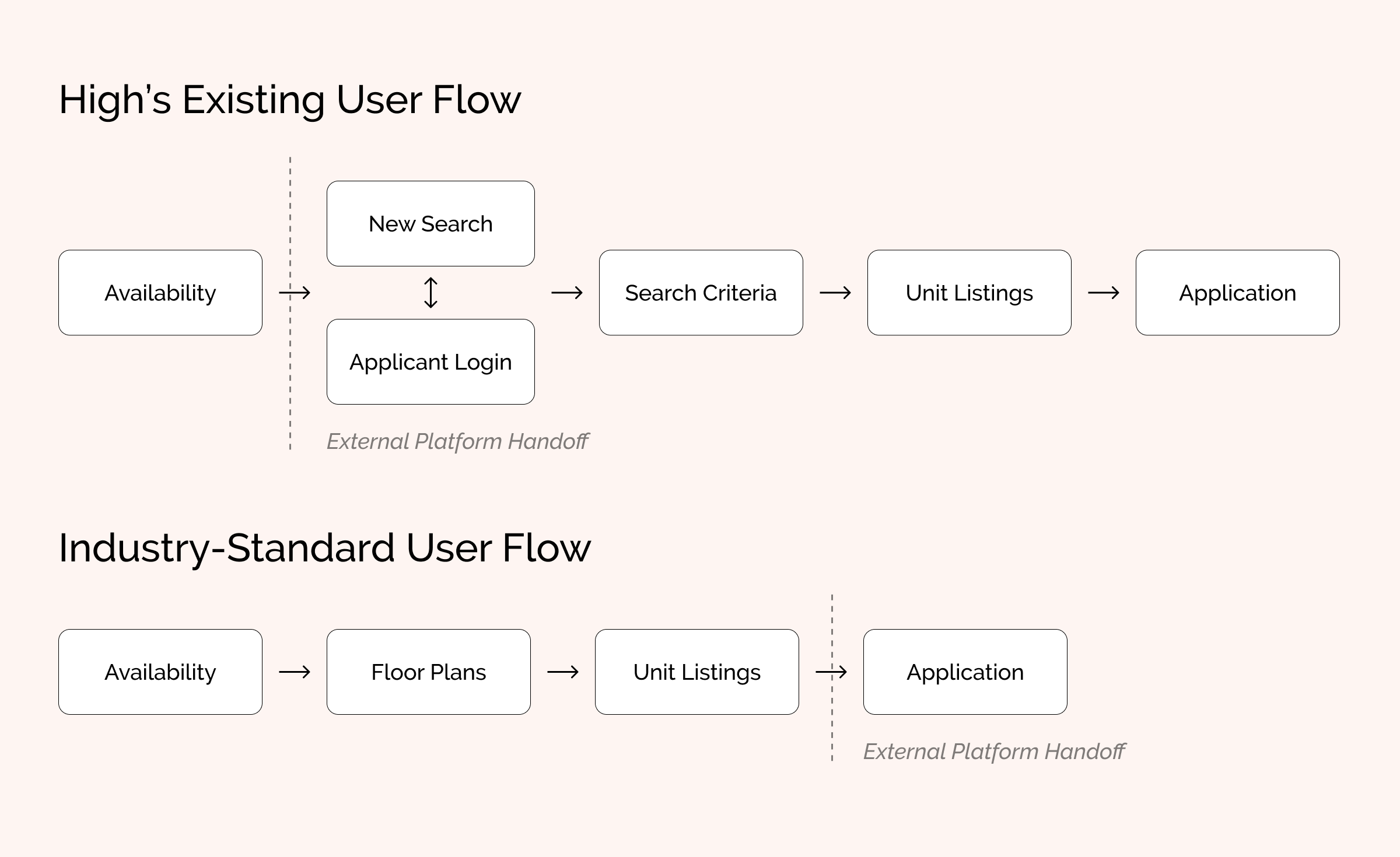
High’s existing user flow felt cumbersome when compared with other industry examples.
Shaping Focus & Direction
A clearer picture of how High’s information architecture and content strategy could evolve had emerged thanks to the insights gained from stakeholder interviews and competitor analysis.
Bringing live unit availability directly to each property site was the single largest opportunity for improvement, reducing the friction found in the current approach. However, two factors needed to be considered before continuing.
High had previously found success with a layout-based tool showing available units mapped across the property complex. First implemented on one site, High planned to continue rolling this tool out to each residential property site. While it was clear this tool added significant value, several core questions remained.
Was a layout-based approach the only way availability should be shown?
Does the layout-based tool have any limitations that could frustrate users?
Was a traditional list view showing availability still needed?
If both approaches were to be implemented, how would one complement the other?
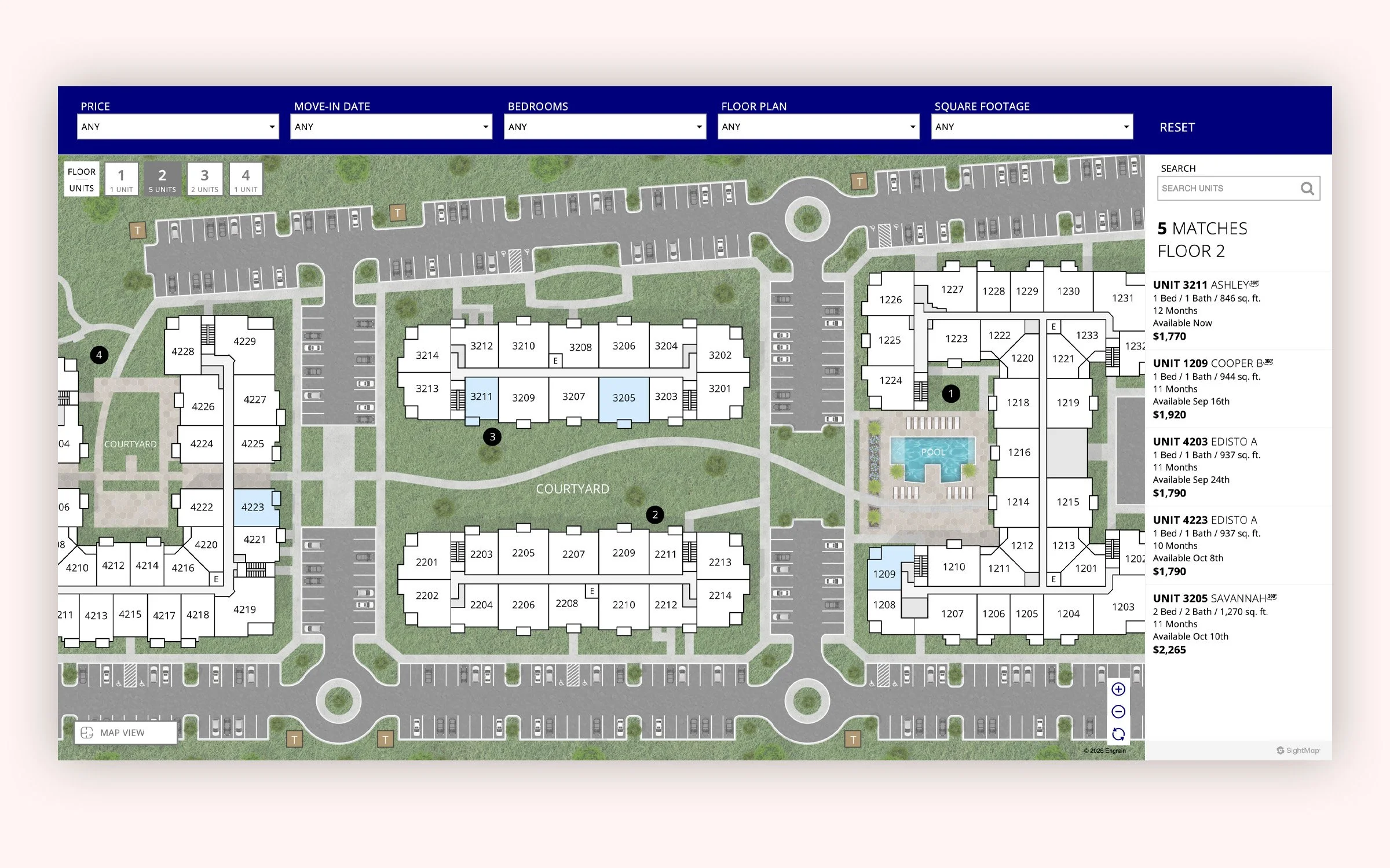
Each of High’s residential sites would include a map-based layout of the property showing available units.
Without relevant industry examples to analyze or access to user data/testing, it was challenging to find clear answers to these questions. However, to accommodate the wide and diverse user base, I guided High towards supporting both approaches. While this increased the overall project scope, it mitigated risk by retaining the industry-standard format while allowing us to test how different users prefer to explore availability.
The other major factor to consider was the feasibility of displaying available units directly on each property site. After coordination with High’s systems administrators and backend development team, we concluded relevant data fields could be imported directly from their leasing management system.
Forming/Exploring Solutions
The next goal was creating a viable way of displaying floor plans and their corresponding unit availability. Following the model identified in my competitor research, I began by establishing a similar flow.
Screen one: Explore floor plan options, select desired
Screen two: Review floor plan details and select available unit
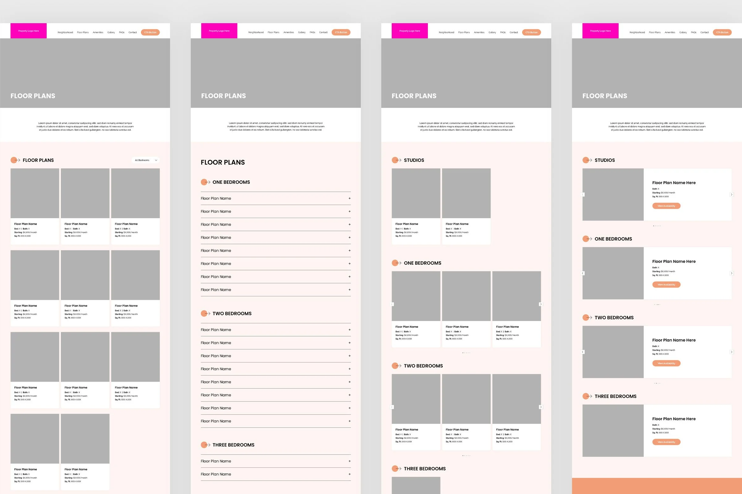
High’s existing platform displayed floor plans in grouped collections based on the number of bedrooms. But with some properties having as few as 4 floor plans and others as many as 35, I wondered if an alternate, more flexible layout would be preferable. Leveraging High’s new design system allowed me to quickly explore layout options.
Using High’s design system I explored layout options for the floor plan directory page.
This exploration guided me towards continuing to organize floor plans in grouped collections based on bedrooms as this approach maximized findability while keeping page depth minimal. Additionally, displaying each floor plan via a full-width content card, nested inside carousels, best utilized the available screen space and provided the right balance of information density.
With this clarity I carried on, next designing the floor plan details page showing layout and available units.
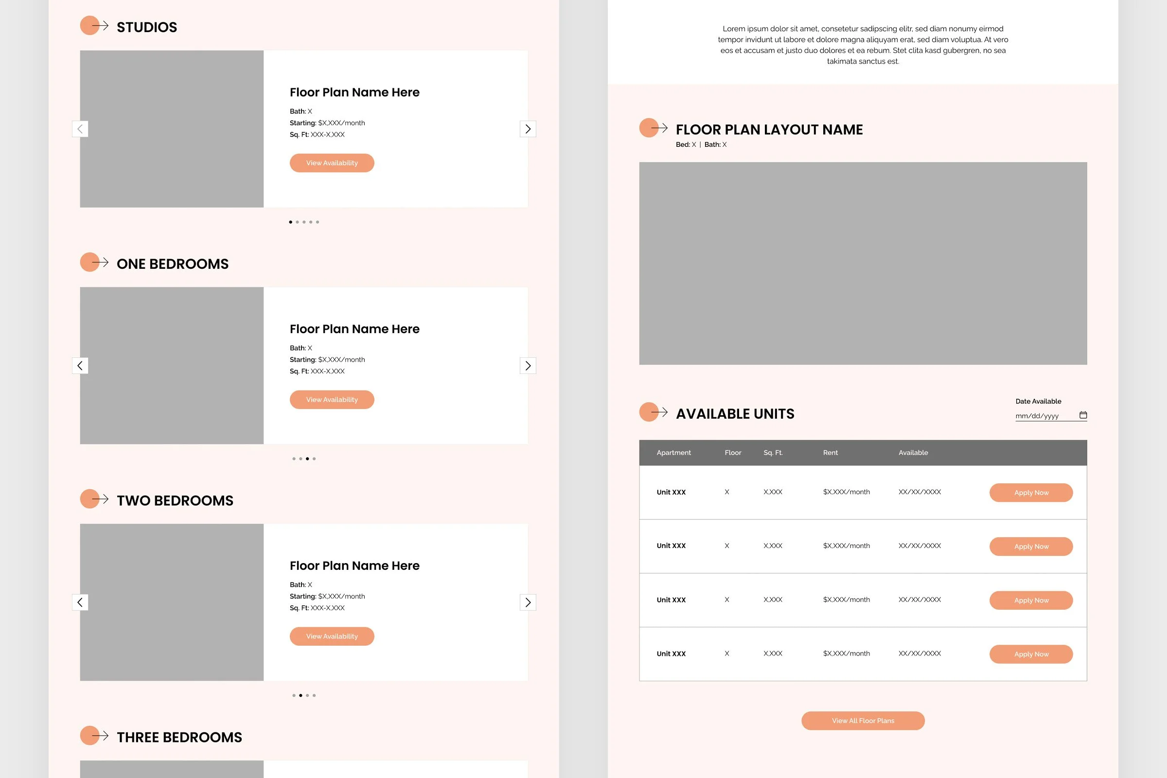
Floor plan directory and detail pages showcasing layout and available units.
Leveraging Stakeholder & User Feedback
After completing the remaining page layout designs, I coordinated design hand-off with the development team to begin building. Our strategy was to first implement the new design in a testing environment and begin collecting feedback from users and key stakeholders.
The most pressing issues identified were the findability and accessibility of available units which were nested inside each floor plan’s details page.
From the header navigation, it wasn’t clear the floor plan page contained availability.
With no indication of which floor plans were currently available, users were clicking into each, often finding a dead end.
There was also confusion regarding why some units were priced differently, despite having the same layout and square feet
Design Revisions
We needed a design solution that would better guide users to what’s available while providing clarity regarding pricing.
I explored separating the floor plans and availability content altogether. While the two are intrinsically linked, I wondered if housing them in the same place was counterproductive. After all, users don’t need a floor plan, they need an available place to live. Why make them sift through various layouts first?
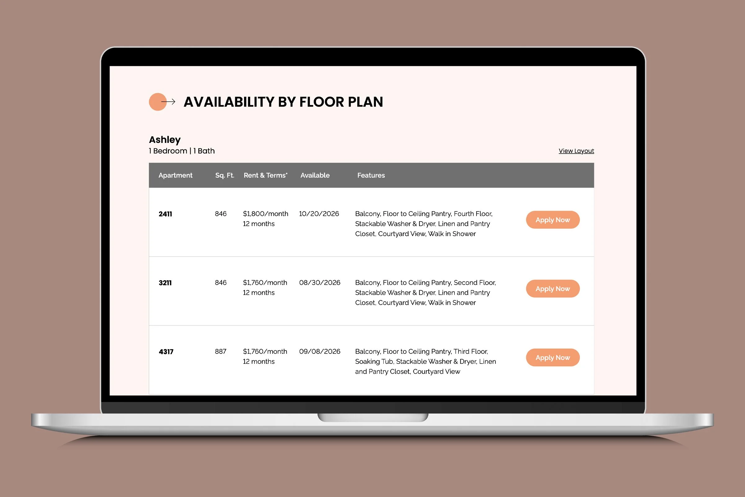
I designed a new page which would list all currently available units in one organized view. The new design also introduced a column for unit features, providing additional pricing context for each unit.
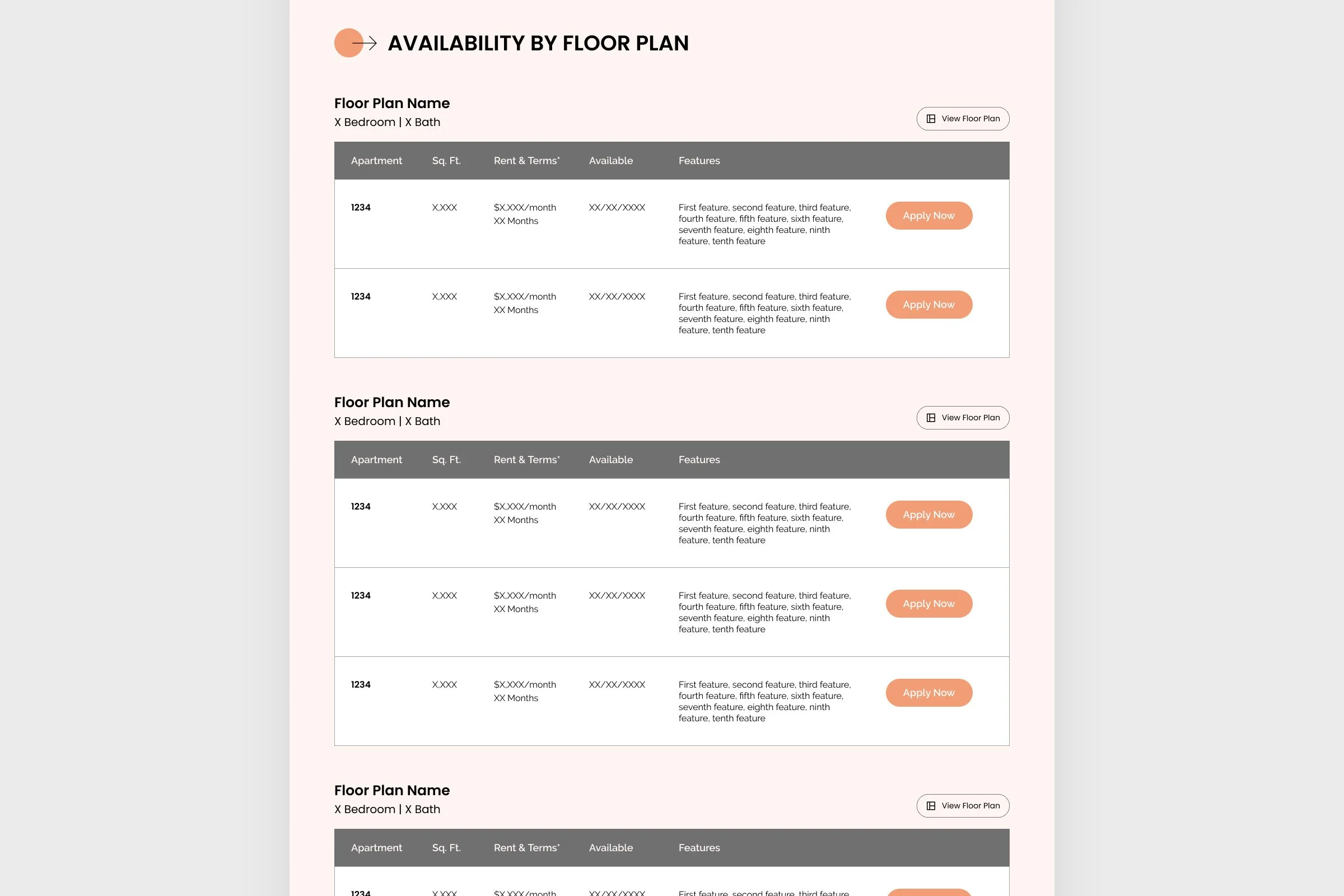
The new Availability page centralized available units in one place, no longer required exploration through floor plan specific pages.
Adding a key page to the platform required reshuffling the space-constrained header navigation. Our team evaluated which links would add the most value to residents and which would increase administrative lift for property managers, leading us to remove Contact and Request Tour in exchange for View Availability and Login.
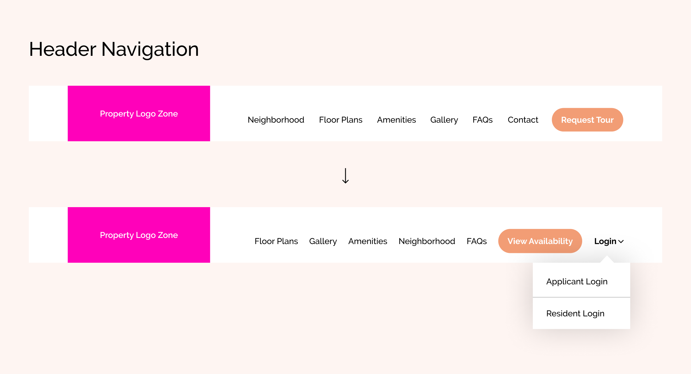
Revised header navigation better guides prospective and current residents to the most relevant actions.
Observing Improvements
The new Availability page, now accessible from the menu, created a seamless and direct path for users exploring what’s available. By comparison, this approach created a more direct route than competitors following the industry standard.
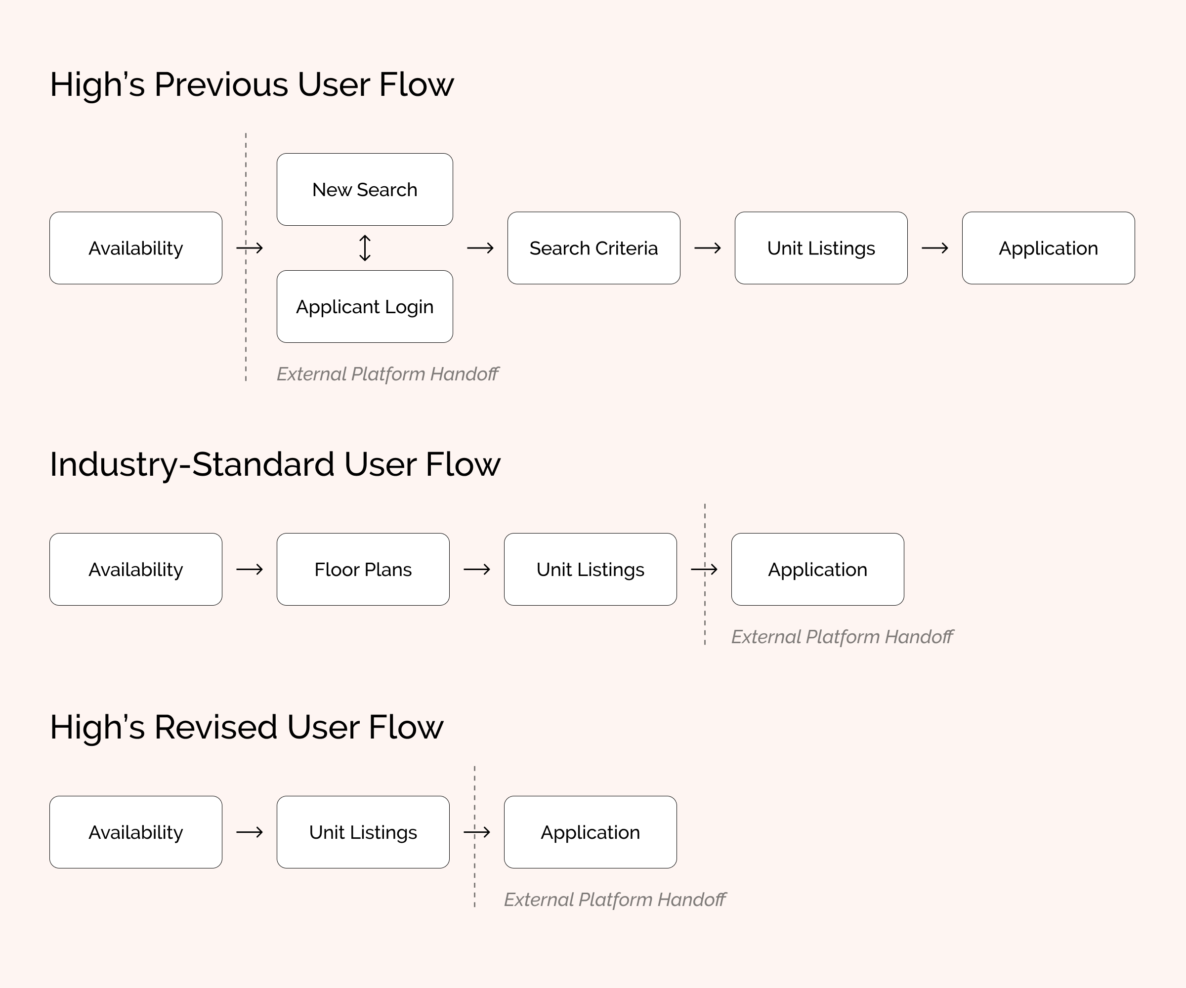
The revised user flow created an ever more direct path for finding available units.
The new Availability page also helped answer one of our previous questions: How would a list view of availability complement a map/layout-based view?
With the list of available units now in one grouped table, users can easily compare the details of each while the interactive map provides a way to explore units one at a time with the added context of its specific location within the property.
Further testing confirmed this approach reduced ambiguity while making access convenient. Some users preferred exploring availability via the layout-based map tool while others preferred utilizing the table-based list view.
Navigating Data Discrepancies
One of the last hurdles to navigate was creating unity between the data displaying in the map and list views. In my testing I observed and documented discrepancies between the rent prices shown in both views as well as units missing from the list view altogether.
To course correct, I coordinated with High’s systems team and discovered the list view was always displaying the price for a 12-month term while the map view was displaying pricing based on the best available term, which was anywhere from 10 to 15 months.
Since this was an intentional strategy implemented for the map view, we mirrored this approach for the list view which required adjustment to the data feed as well as the addition of a terms field in the UI to provide the price with relevant context.
Our investigation also identified units missing from the list view were caused by data entry errors.
Process Reflection
Synchronizing High’s available units seemed relatively straightforward at the beginning of the project, but it evolved into a complex challenge that required new processes to ensure accurate data was displayed across every property site. As a result, the project's scope and timeline expanded.
In hindsight, a more thorough early-stage examination of the configuration process would have helped us better estimate the project’s scope, set expectations earlier, and avoid late-stage integration issues.
Celebrating Changes & Improvements
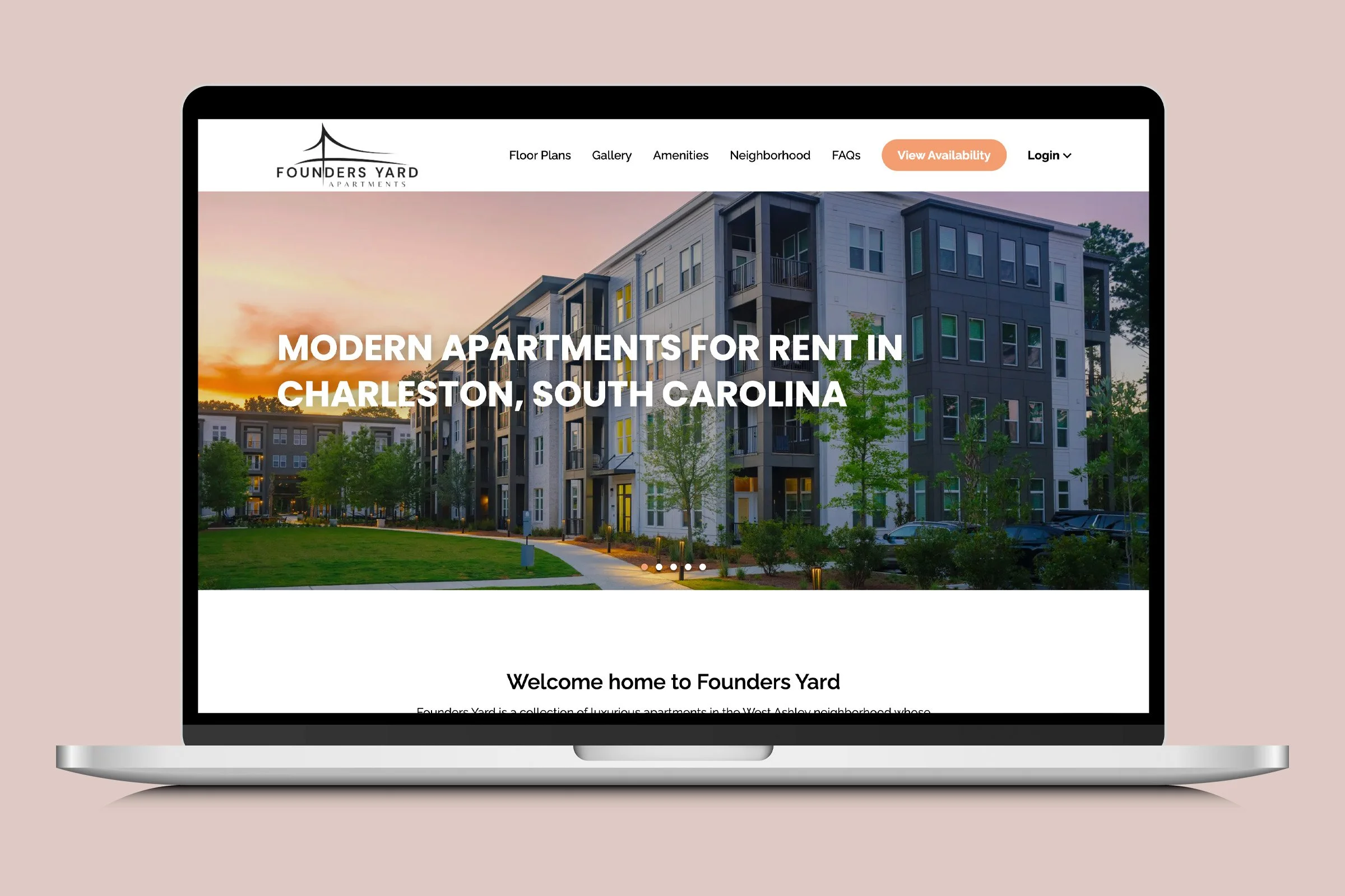
High’s new platform for residential properties produced increases in overall traffic, organic search visibility, and completed applications. Comparing year-over-year performance across 11 properties, I observed the following improvements.
Total page views increased by an average of 6.6%
User sessions increased by 7.5%
Organic search traffic increased by 8.5%
Applications submitted increased by an average of 7.4% with 4 sites seeing increases of over 30%
While Floor Plan page traffic dropped approximately 30%, the newly introduced Availability page became the second most-viewed page on each site, totaling more than 39,000 views across all properties during the first 2–3 months following launch.
After the intentional removal of Contact from the header navigation, traffic to the page dropped 77%. However, the introduction of the Request Tour page yielded a total of 588 page views and 218 form submissions during this period.
These changes reflect a positive shift towards a more intentional leasing journey, with prospective residents finding and engaging with the most relevant site content.
Beyond the Numbers
In addition, High’s redesigned platform elevated the brand of each property with more relevant content and consistent messaging. The flexibility of the design also allowed us to seamlessly adapt the template across all of High’s existing residential properties and accommodate future property developments.
This project was completed while employed by Fig Industries, a creative agency in Lancaster, Pa.